Monday, June 13, 2011

Chroma Kee

I’ve always found that I learn far more about a piece of software through playing rather than working and that’s certainly been the case with the offline video editing program Kdenlive. I’ve also found that when you have a definite goal in mind then “the software doesn’t do that” no longer becomes an option and you use the software far more inventively in order to achieve it.

And so it proved when I decided, using Flash 8 and Kdenlive, I’d try and recreate the title sequence for ITN’s News At One. I first saw this title sequence back when the programme was called First Report – that was before the soporific Aussie soap The Sullivans pushed the programme to its more familiar one o’clock slot.

Here are the original News At One titles that someone culled from TV Ark:


As you can see, it’s quite a complicated title sequence and people who know far more about this sort of thing than me have noted how hard it would have been to achieve in the 70s. They’ve always been very, very good technically at ITN.

Although I haven’t got a clue how ITN did it, I decided on the basic approach of having two layers of video in Kdenlive for my version.

The bottom layer would be the typing hands (or paws in my case – thanks Lionel!). These were shot on my little Canon Ixus camera and then put through the Kdenlive “Threshold” filter and coloured with, of all things, the MSU Old Cinema filter.

Lionel touch-typing

The top layer of video would consist of the zoom out of the Houses of Parliament’s clock tower (replaced by the block of flats where I live) which fades out, and the photo montage of odd people and drab places (replaced by pictures of my daughters, their toys and things in the square outside).

Creating the montage for the top layer was straight forward. I loved the fact that, on the original, the outlines around the images were all different widths, and some of them were even bent out of true. Even the top of the News at One logo was at an angle!

Creating the montage in Flash

The problem I faced was how to merge these two layers. My first thought was to use a Chroma key, but this gave me all sorts of problems and some rather nasty digital fringing that looked like anything but 70s television.

Click to enlarge

What I really needed was to be able to export transparency from Flash into Kdenlive – and it turned out that I could. The first step was to export the sequence out of Flash 8 as a PNG sequence at 24 bits per pixel with alpha channel, like this:

Getting transparency from Flash to Kdenlive

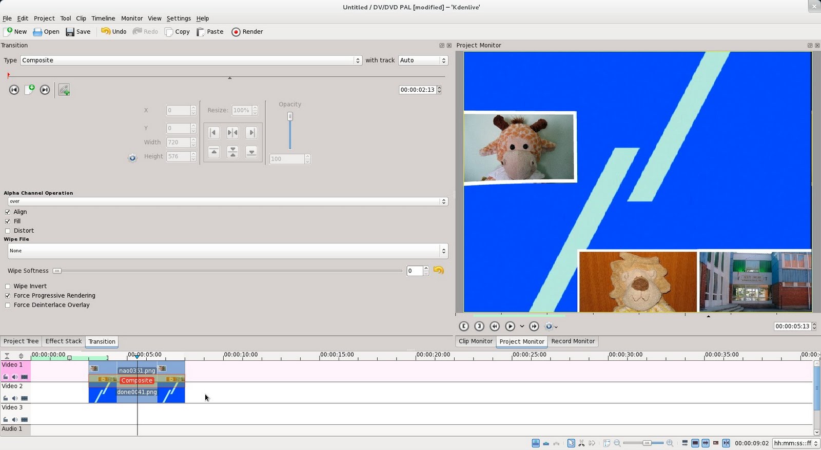
Then I could import the PNG sequence into Kdenlive, and use a Composition transition to knit the two layers together.

Click to enlarge

PNG sequences are the best thing ever invented for my work – everything can use them perfectly and they mean that I can transfer work between packages without losing quality or suffering odd effects.

So, here’s the finished sequence:


Now I understand keying properly I can do loads of things I thought I simply couldn’t do before. And all because I thought I’d do a little sequence to make my daughters laugh.

Saturday, June 11, 2011

Test Card F Prototype

One of my favourite websites is Mikey Bennett’s Vintage Technology page. I love looking at all the vintage television sets Mikey has lovingly restored back to full working order. If your old Bush has lost its colour or your horizontal hold is ruining your enjoyment of your Rank then Mikey’s your man.

Mikey on an experimental 1969 3-D television

A few years back Rory Clark created a very entertaining DVD to demonstrate all the sets in the South West England Vintage Television Museum collection that Mikey curates. The DVD featured a range of test cards and tuning signals from the very old up to the present day accompanied by a selection of tones and music. Although it has given sterling service since then, Rory wanted to create an updated and expanded DVD for Mikey.

One of the cards Rory wanted to include this time was a prototype Test Card F featuring a rather different picture in place of Carol Hersee. Here’s the original:

String vests have never photographed better

Unfortunately the surviving scan of the card wouldn’t really show off Mikey's television sets to best effect as it has faded quite considerably – the grey linearity squares had a distinctly reddish cast and the green castellations in the reference generator area had almost gone black. Therefore Rory asked me if I could recreate the card.

To do this, I used Inkscape as I only draw items in Flash now if it’s completely unavoidable. This is what I came up with in Inkscape:

She’s gone. Was it something I said?

The hardest job when recreating the card was doing the hand lettering on the caption. I did experiment to see if I could get away with using Benguiat Condensed, but it simply didn’t look close enough. In the end, the lettering took as long as the whole of the rest of the card.

It’s interesting to see the differences between this card and Test Card F. A good place to go to find out what's missing is Alan Pemberton’s Pembers’ Ponderings website. He has two clickable Test Card Fs which will tell you exactly what each part of the card does.

I can't wait to see how Rory “distresses” the my Inkscape drawing to make it look like a real transparency on the finished DVD.

Sunday, May 29, 2011

It’s BBC 2 you want…


I felt it was time for an update of my 2008 showreel as the network globes in particular were a mortal embarrassment to me and I also hadn’t “distressed” anything on the old version as, back in 2008, I didn’t know how. I’ve thoroughly picked Rory Clark’s brains since then!

The Flash was exported out as PNG sequences for processing. The film effect was done using the MSU Old Cinema plug-in in VirtualDub and the MLT Old Film plug-in in Kdenlive. I also used The GIMP in batch mode with some Scheme scripts I wrote to add some “glow”.

I found Kdenlive to be an excellent and extremely capable off-line editor but cutting to music was hard as what you saw in the application didn’t always reflect what you saw in the finished video. I’ve found out that this was not a problem with Kdenlive – apparently it’s due to the various bits of the Fedora 15 audio stack not talking to each other nicely. Whatever the cause, it meant I had to edit the whole of the last thirty seconds by rendering to video, adjusting and then re-rendering as the timing shown in the time-line was at least a second adrift of the finished video by then! Therefore the cutting isn’t as tight as I’d like in places.

The captions were all “distressed” using The GIMP. I’m still a bit hit and miss at doing this but I’m very pleased with the Lancashire and Central Scotland IBA Transmitters In Service captions.

Please go to the Barclay James Harvest home page and buy a copy of Grim by Maestoso if you like the music. The song is called “Location Location Location”.

Wednesday, May 25, 2011

How to make envelopes…


Bizarrely, although I uploaded this video as a shiny new WebM file, YouTube needlessly transcoded the video to H.264 and insists I need to download the Flash Plug-in to watch it. How strange…

Wednesday, May 18, 2011

Numlock Edge


If you are considering installing the Fedora GNOME 3 Beta and want to try and use it for anything vaguely useful, I’d strongly advise installing numlockx along with it. This ensures your Num Lock key is enabled by default, thus preventing you from inadvertently teaching your neighbours some new English vocabulary.

Wednesday, May 11, 2011

Feeling cut off…


If you are wondering why you can’t contact me today, it’s because I won’t have any electricity and probably no telephone either. The cables that are currently suspended from telegraph poles in my street are being being buried under the pavement.

Monday, May 09, 2011

Lime Grover Washington

Lime Grove with Washington signs

I’ve kerned A–Z, a–z and 0–9 of the Washington typeface so that it’s useful for most English language applications.  Version 2 of the typeface is available to download here. The version 2 package includes the FontForge source file, along with a PDF showing the available glyphs. Windows users will probably need to download the 7-zip utility in order to decompress the archive file.

Friday, May 06, 2011

Washington Post

For a child born in 1971 and growing up in 70s Britain, probably the most magical place in Britain would have been BBC Television Centre. And, thanks to Blue Peter, it was a building that I was pretty familiar with. After all, Peter Purves had shown me countless times that the building was ‘like a huge doughnut, with studios around the outside, offices inside the centre ring and a fountain in the middle’.

BBC Television Centre, front gate

One of the most distinctive features of the building was its signage. The same typeface was used on everything from cameras to warning lights to the front gate.

EMI 2001 with Raymond Baxter

The typeface employed was a very common sight when I was five years old. It was used all over Chard Post Office, on signs made by SWEB (the South Western Electricity Board), and even for signs on the changing room doors at Maiden Beech School in Crewkerne. But, as I grew up, this signage was slowly replaced by signs using more modern faces. By the early 80s BBC Television Centre was just about the only place where it could be seen.

BBC Television Centre Studio One

I’d always wondered what the typeface was. The first clue was when I bought the book Encyclopedia of Typefaces by W.P. Jaspert et. al. The book contained a small scan of the face labelled as ‘Doric Italic’. This led me to search on font websites under the ‘Ds’ until I found a typeface that was called ‘AT Derek Italic’. This was close. In fact, it was very close. But it wasn’t right.

AT Derek Italic

For instance, in order to recreate the 1960s caption below, I had to alter the AT Derek lettering extensively:

BBCtv Science and Features recreated

The face used came up in conversation at The Mausoleum Club. The Mausoleum Club is a web forum for people who want to talk about proper television rather than other the kind that we get these days.

By a stroke of good fortune, BBC Graphic Designer Bob Richardson was present and he told me for the first time definitively the name of the font. It was called Washington. I then spent a couple of days plucking up courage to ask Bob if he would be kind enough to send me a scan of the font so that I could recreate a digital version.

Bob was very, very kind and also keen to see a version of the font in truetype form – I received a scan of Washington the next day. The scan he sent was taken from his copy of the BBC Graphic Design Print Room specimen sheets. The book contains all of the metal typefaces that were available to graphic designers (or ‘commercial artists’ as they were initially known) from the early 1950s until circa 1980.

Washington recreated by the BBC for a capgen

Bob told me that the BBC had actually recreated Washington in a format suitable for a caption generator for ‘The Lime Grove Story’ (a 1991 documentary to commemorate the closing of the BBC’s Lime Grove studios) but the BBC didn’t have a version of the font in truetype form.

So, now I had a scan I needed to recreate the font. The plan was, as usual, to trace each character or ‘glyph’ in Inkscape

Tracing in Inkscape

…then import the glyphs I had traced into FontForge

Glyph imported into FontForge

…and use FontForge to generate the final typeface.

The finished typeface

This is exactly the same way as I had recreated the Central Television corporate font, Anchor and Oxford. Only this time I had the best source material possible.

As I’ve talked about recreating fonts extensively in the past I’ll just talk about a couple of things that were either new or different in this case.

P and R superimposed

The first thing of interest was that the font was a real, live metal type and it wasn’t as ‘regular’ as I had come to expect from digital faces. The width of the vertical stroke in the ‘P’ would be quite different in width to the vertical stroke in the ‘R’ which would both differ in width of the vertical stroke in the ‘D’.

It was this kind of irregularity that really gave the font its charm and sold it as an old metal typeface. Therefore I was determined to keep that as much as possible and not to try and make the font too regular and clinical by ‘fixing’ all these quirks.

R coming to the point

The second thing I needed to know was when to ignore curves. Letters such as the capital R would have curves at the corners where you would expect them to come to a point. I did toy with the idea of leaving these curves in place but that looked dreadful at large sizes so that was one thing I did end up ‘fixing’.

There were a number of glyphs I had to create myself, as they didn’t exist when Washington was created or were not a part of the original face. For instance the Greek letter mu is a combination of the letters p, q and u:

P, Q, U make a MU, Cuthbert dribbled and guffed

I also added things like Euro and Rupee currency symbols, copyright and trademark symbols and so on.

One thing I did this time, which I should have done before, was get FontForge to create all the accented glyphs for me. In other words, instead of creating separate Inkscape files for each accented character and importing them into FontForge, I simply created each accent as a glyph and got FontForge to automatically create all the accented characters for me. This saved me a huge amount of time.

Once you’ve created these few characters…

It’s important for me to have a decent coverage of the Latin alphabet as I know first hand how frustrating Hungarians find it to have to use a tilde or diaeresis instead of their double acute. I also like to make sure that the Welsh language can be used with any typeface I create.

…you get all these free!

FontForge created the accented glyphs almost perfectly and out of a few hundred glyphs I only needed to adjust half a dozen by hand. I found this pretty amazing.

Buoyed with my success at automatic accented glyph creation I thought I’d try some automatic kerning. Kerning is the adjustment of the spaces between letters. For instance the distance between the letters ‘T’ and ‘o’ in ‘To’ is quite different to the distance between the letters ‘T’ and ‘h’ in ‘The’.

Good kerning makes all the difference to the appearance of a typeface. Here's the word ‘colour’ unkerned…

Colour with no kerning

…and here it is kerned.

Colour kerned

For all my other fonts I had sat down and kerned every possible letter combination by hand. The results are excellent but it also involves a large amount of wasted effort. The reason is that many letters (e.g. c, o and e) kern exactly the same as each other. FontForge not only allows you to put these letters into ‘classes’ to kern as a group, but it will also detect these ‘classes’ for you and attempt to kern them all into the bargain.

Kerning by classes – click to enlarge

I tried using this feature for the first time with Washington, and it worked pretty well for most letter combinations. However I do need to tweak this kerning by hand to ensure that all possible combinations of letters look good. Until this is done the font is only really useful for desktop publishing or vector art where you can alter the kerning of each letter combination by hand.

This task will take two or three days to do and it’s not something I want to do now, as it is really a job you need to come to fresh. So in about a month or so I’ll kern the font and release version 1.1 – I’ll post here when the hand kerned version is available.

So when the font is exported, how does it fair? Well, here's an example I put together which compares Washington to AT Derek:

A comparison - click to enlarge

As you can see, AT Derek may be more elegant but Washington is definitely more ‘BBC’!

The Washington Book typeface is released under the SIL Open Font licence.


All the software I used to create the typeface was free software, including the operating system – Fedora.

You can download the latest version of the Washington font from here. Windows owners will need 7-zip to uncompress the archive. The font is free – the only thing I ask is that if you find it useful please drop me a line or add a comment below as I’d love to hear from you.

Thursday, May 05, 2011

Music for Pleasure

This album is probably the greatest thing to come out of Switzerland since the Toblerone:

Playing Paul, Eating Black Milk

Saturday, April 23, 2011

Replay Replayed

Replay Expo time is fast approaching again, which is why Barbara Kelly and Lady Isobel Barnett are pictured below modelling an original piece of my artwork:

Sadly, Doris Speed wasn’t free.

Replay Expo is an Arcade, Video Game and Retro show that takes place every autumn at the Norcalympia Exhibition Centre in Blackpool. Last year’s event attracted 3,200 visitors over two days and the organizers are hoping to attract 5,000 this time. The show is timed to coincide with the last weekend of Blackpool Illuminations.

Last year I was involved in designing fliers, banners, advertisements and the website for the show and the organisers very kindly asked me if I would like to continue doing so this year.

r3play 2010

The first thing I needed to do was devise a “Replay” logo for this year’s event. The brief was “the same, but different”. The previous logo was originally designed by “Greyfox”, also known as the talented Irish graphic designer Darren Doyle. It was a beautiful logo and worked fantastically well so I wanted to keep as close to it as possible.

I had two main ideas. Firstly, I wanted make the logo a little more colourful, as the show will be a little more colourful this year. Secondly, I wanted to include a cartoony black outline around the lettering to increase the contrast from a distance and also to evoke the black outlines around cartoony video game characters.

In addition the logo had to be vector illustration, as I would need to export it at some very large sizes indeed. This meant I created it entirely in Inkscape.

This is what I came up with:

replay 2011 – click to enlarge

It was one of the only occasions I’ve ever got it right first time! You’ll notice I had to reverse the “E” because last year people insisted on calling the previous event “are three play” which rather upset the organizers!

B790 – I’m sure this face has a real name!

Next was the question of typography. Last year was easy – I was using lots and lots of lovely Microgramma. This year it was again “the same, but different”, so I settled on a Hermann Berthold art deco typeface called B790. This was similar enough to Microgramma that I could use it in the same sort of ways, whilst at the same time looking very different.

The one thing I was disappointed about this year was the design of the 2011 lettering. I spent day after day producing draft after draft:

My favourite – I spent hours on this!

Another massive fail

Obviously massive fails come in threes

However, in the end nothing I produced seem to grab the client – something that was entirely my fault. In the end, with half an hour or so to spare before stuff went needed to go off to the printers I gave up and produced something quick I’m really ashamed of.

At least the client liked it.

As you can see, the B790 ended up with a bit of a starring role as I used it for the word “EXPO”.

Producing the fliers and roll up banners for Replay Expo was rather interesting this year as the printers decided that only CMYK PDF files were acceptable. In previous years, they had accepted RGB TIFF files exported at 300dpi (dots per inch), which I could export from either The GIMP or Inkscape. But neither Inkscape nor The GIMP can currently produce CMYK PDF files. Therefore, after meaning to do so for nearly three years now, I finally had a good reason to grips with Scribus, a free software desktop publishing package.

The first thing I had to do was a lot of reading. The Scribus documentation is excellent and very thorough, so it was a pleasure to go through it all. Then I went through the tutorial. I had to do that when the children were at school as the first couple of hours featured a statue of a rather forgetful Indian lady who had absentmindedly neglected to put on her undergarments.

She’ll catch her death of cold…

Fortunately, I had colour management set up on my computer, so soft-proofing worked perfectly. This meant that whatever I saw on screen was very close to how my finished artwork would appear in print.

I produced my Replay logo artwork in Inkscape, and exported the logo as a 300dpi RGB PNG file for import into Scribus. Usually I could import my Inkscape files directly into Scribus, but in this instance I was using Inkscape layer effects (i.e. SVG image filters) that Scribus is currently unable to cope with.

Flier created in Scribus

I then created the text and frames directly in Scribus, and imported the photographs into them. It’s actually a very nice way of working as you are using each tool for what it does best.

Once finished, I could export my Scribus file as a CMYK PDF, send it off to be printed and hope for the best.

This was all completely new to me, and I was really nervous as to whether my exported PDF files would even be accepted by the printers, let alone print properly. What was worse was the fact that the Gadget Show Live event was two days away and there wasn’t time to do anything if my files were no good!

Anne Ladbury and Mary Morris

However, as you can see, they turned out quite well. Scribus is an excellent piece of software and I would recommend it to anyone.

Replay Expo takes place at the Norcalympia Exhibition Centre, Norbreck Castle, Blackpool on the 5/6 November 2011. Tickets for the event are available from http://replayexpo.com/tickets

Thursday, April 21, 2011

Fedora 15 Beta, GNOME 3

Recently, a rather nasty crash caused by the gftp FTP client locked me out of all my files and shut me out of my Desktop. The program is rather ropey and has done odd things to my computer before so I really shouldn’t have been using it.

Still, every cloud has a silver lining and since then I’ve moved to Filezilla as an FTP client (which is a lot better anyway) and become rather less blasé about making backups.

GNOME 3 Desktop - Click to enlarge

As I needed an OS reinstall I also decided to take the plunge and install Fedora 15 Beta. I’d been reading about GNOME 3 for years so I thought it was high time I tried it for myself.

Here are my thoughts so far:

Pros:
  • I was delighted to find my Trust 5300 graphics tablet works out of the box. No compiling and installing Wizardpen and playing around with settings. This is very important to me as I’m fond of using MyPaint to paint pictures when I'm listening to podcasts. It’s also very useful in conjuction with The GIMP.
  • I was disappointed at first to find that Colour Management was missing, but once added using Add/Remove Software it’s better than ever. Work has been done to make it easier to use and it has had some bug fixes too. Colour Management would be enough to justify my using GNOME3 on my production machine.
  • Firefox 4 is fantastic – I love being able to play HTML5 videos at long last without needing a Flash plug-in.
  • I was surprised that I couldn’t just press Delete in the Nautilus File Manager to remove files. You have to press Ctrl+Delete together. However, I like this better as it makes it much harder to delete things by accident.
  • It only took me about 30 seconds to work out how to use it.
  • It gets out the way most of the time and lets you get on with your work.

Cons:
  • The most serious problem is what happens when you switch off the computer. For some reason the Shut Down option is missing unless you hold down the Alt key. By default, you can only Suspend, rather than Shut Down your computer. This would be no problem at all if it were not for the fact that Suspend only works about one time out of four for me; Suspend is simply not stable enough to replace Shut Down.
  • You cannot alter how fonts are hinted on screen. This is very irritating as the default settings make text look, frankly, revolting.
  • The weather widget is missing – it showed the current weather, temperature and windspeed. I find that hugely irksome – I don't mind it not being on the desktop but you should be able to see it when you click on the time at the top of the screen.
  • The title bars on the windows are too tall for no good reason. The whole of the rest of the interface seems to be about conserving vertical space, yet this throws away everything gained by losing the bottom panel.
  • Some dialog boxes are missing close buttons.

The whole system feels very stable indeed and I’m using it on my production machine quite happily even though, really, I shouldn’t be!

It’s just not Flash…


I’ve finally worked out I can put YouTube videos in my blog that can be viewed without having the Flash plug-in installed. Which is handy for me, as I don’t have the Flash plug-in installed. And presumably it’s also a boon for anyone using one of those ingenious new Apple etch-a-sketch things.

So, now I can watch stupid rubbish without using my daughters’ computer, here’s some that I (and Rory) made earlier…

Tuesday, April 19, 2011

Notable Use

I was looking at the excellent Chris’s Acorns site the other day, when I found another archetypal use of Christine Lord’s Oxford typeface on a BBC Micro peripheral:

Judging by the LEDs, it also doubles as a light show

This is precisely the sort of application for the Oxford face I remember seeing all over the place as a child. Whatever would the UK electronics industry have done without it?

Monday, April 18, 2011

Gotta Dash

One of the most interesting aspects of working on Repton: The Lost Realms was having my sleeve artwork and inserts proof-read by Michael S. Repton. Michael is a professional proof reader, a linguist and someone who really knows his stuff.

Michael S. Repton playing Galaforce
Photo Courtesy Joel Rowbottom

One of the things that Michael disliked about my copy was my use a minus sign to indicate a pause. I had to replace every single one with something called a spaced en-dash.

Of course, I’m not really to blame for this – computer keyboards are rather deficient in the punctuation department. As a rule, they don’t have a real apostrophe or proper opening and closing quotation marks. But whilst your keyboard doesn’t have these symbols, your computer almost certainly does. If you have a look at the Character Map application you can find them all.

Character Map on Fedora 14 - Click to enlarge

The problem is that using the Character Map application every time you wanted an apostrophe or quotation marks would be too slow on a large document. Fortunately there is another way of entering these punctuation marks in GNU/Linux. You hold down Ctrl and Shift, press the u key, type the four digit Unicode value for the symbol you want and press ENTER.

So, an en-dash is Ctrl+Shift+u 2013 ENTER. After a while, you find you remember the most common symbols. An apostrophe is u2019, quotation marks are u201c and u201d and so on.

Characters of Gnote

To help me remember the less common symbols I put a list on a pinned Gnote, which I can call up easily whenever I need it.

Sunday, April 17, 2011

All The Hues That’s Fit To Print

Whenever I’m using a complicated piece of software, I find it’s invariably the things that I ignore that turn out to be the most important.

The Blob

When a strange, grey blob-shape appeared between my scrollbars in Inkscape about 18 months ago I completely ignored it and carried on drawing and colouring in. Not only was it vitally important, but if I had only been curious enough to find out what it was sooner I would have discovered a whole new and fascinating world: colour management.

I’ve never had enough money to own a colour printer; I only have a monochrome laser printer which I use very sparingly as a toner cartridge is almost third of my wife’s monthly salary. So I’d never really thought about colour printing until I started designing covers for Retro Software. Dave Moore would sometimes ask me to change this colour or that colour as “it looked awful when printed out”, I’d grumble and change the colour and that would be as far as my interest in printed colour would go.

If I kept myself up to date a little more dilligently I would have realised that that little blob-shape would have allowed me to see what my designs would look like when printed right there in Inkscape.

Colour management seems like too much faff to bother with at first, but is actually pretty simple. When you’re designing on screen, you’re working with light. Light is “additive” – every time you mix colours together you get a lighter colour.  This is usually illustrated using the famous “light spots” you may remember from school (or college):

Avez Vous Le Tempo?

So, for instance, cyan looks lighter than the green and blue you mix together to make it.


When you print you’re working with inks, which get darker as you mix them together. So, for instance, the colour blue is much darker than the cyan and magenta inks you mix together to make it.


The upshot of all this is that there are (quite a lot of!) colours you can show on your monitor that you simply can’t reproduce in print. Pure blues and pure greens that look vivid and exciting on screen look like faded socks and mouldy cheese when printed out.

The precise range of colours you can use on a printer depends on the type of printer you are using. A colour newspaper press can print a far narrower range of colours than the one used to produce a colour magazine.

Conversely, a printer can produce darker colours than you can reproduce on a screen. And each model of scanner, monitor and digital camera has its own quirks as to the range, or gamut, of colours they can deal with.

A horseshoe, apparently

Hence the blob – the blob-shaped icon was based upon the standard horse-shoe shaped graph used to illustrate colour spaces.

The solution to the problem of differing colour gamuts was the creation of a file format called an .icm file. Each .icm file contains an ICC profile which describes the colour gamut of a monitor, printer, camera or scanner. This means that provided you have an .icm file for your monitor and a .icm file for the printer you want to use, your graphics program should be able to use them to show you on screen what your output will look like when it’s printed.

Getting hold an .icm file for your monitor is a pain. Professionals have hardware  calibration devices that they use in conjunction with a program like ArgyllCMS in order to calibrate their monitors. Windows users with Adobe software can use Adobe Gamma. The rest of us can make-do by using a tool called lprof and create a profile by eye. You may find you need to adjust the colour temperature of your monitor to 6500K before you calibrate your screen.

If you are using Fedora, Colour Management is very, very easy to set up in Inkscape. First, you have to get a program called lcms using the “Add/Remove Software” tool. Once you have installed it, you simply have to click the mouse a few times in an Inkscape dialog box and that’s really all there is to it.

Settings to see the effect of Colour Management

Here, I’ve just checked the “Simulate proofing on screen” and chosen a printer .icm in the “Device Profile” box. The display profile should be the profile of your monitor – I haven’t generated one yet so I'm using sRGB.

The Blob In Colour

The blob-shaped icon now springs to life. It is not only in glorious colour but it has also become a button; pressing it has interesting results. Here is my drawing without pressing the blob-shaped button:

Living Colour on screen…

And here is my drawing with it pressed in:

…but the blue and green won't look as good printed!

This is a huge help when designing, as I can now see what my RGB designs will look like when printed out in CMYK.

There is a lot more to the subject of colour management, even in Inkscape. You’ll have to do a bit of research on the web to get to know which .icm profiles to use and the best workflows for CMYK output. But hopefully I've encouraged you to at least have a play!