I had the font I wanted to digitise as a high quality scan. I imported that into Inkscape and created all the characters, or glyphs:
As it was my first time doing this in Inkscape, I made a number of mistakes. Firstly, I created the fonts as filled shapes. If you are going to create a TrueType font then outlines are enough. The biggest problem with using fills instead of outlines in Inkscape is that you can never see if a path is "closed" properly - this will cause problems for the font editing software later on.
Another mistake was that I had forgotten I could not overlap paths - if you do, the overlapping area becomes transparent. Each path has to be made of continuous oulines so, in the case of the capital letter Q I could not draw the circle as one path and the square tail stroke as another.
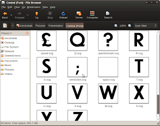
The next thing I needed to do was to create an .svg file for each letter.

.svg files created for each glyph
Again, I made mistakes doing this. I created a 1000 x 1000 pixel file for each glyph with a 200 pixel base line that the letters would sit on. I should have realised that for .ttf files your glyph size needs to be a power of 2, so I should have used 1024 pixel files.
The next thing was to import the glyphs into FontForge 2. FontForge is an excellent program, if you can get past the fact that the interface looks like it decided 1990 was so lovely it would stay there. It looks a bit daunting but in fact, skimming three pages of the online manual, including this one, was enough to create a truetype font with metrics and kerning.
The most valuable thing in FontForge is the Ctrl+Shift+D to correct the direction of your paths (whether your paths are clockwise or anticlockwise is something very important for font creation).
Once you have got your glyphs imported into FontForge, what you have in essence is a monospaced font - all the letters are the same width. The next job is the metrics - in other words changing the widths of each letter so that the I is thinner than the Q. FontForge makes this very easy, with a drag and drop interface.
After that you have to correct the Kerning - in other words coping with the fact that with two letter combinations such as AV the V is should be moved a little closer to the A. This was a little complicated to get started but again it's drag and drop. It took me about three hours to do the metrics and kern all the letter combinations for my font by hand.
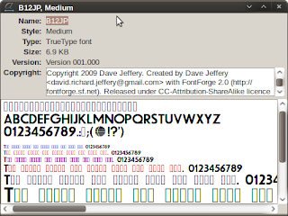
Once that was done I just needed to generate my .ttf - something very satisfying.

The end result - B12JP.ttf
And the software didn't cost a penny. And indeed, neither does the font. I've released the font under CC-BY-SA and it is available to download from here.


No comments:
Post a Comment