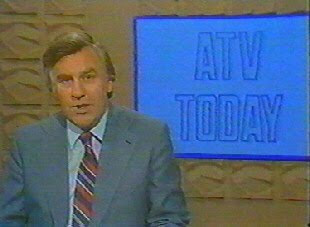
Reg Harcourt - ATV Today
I knew exactly the set he had in mind. It was the lovely beige one with an abstract geometrical design. If ever a set designer managed to capture the essence of the seventies current affairs in one set, this was this one. I managed to get a couple of pictures from Jase Robertson's site sub-TV.
At the time, I had mislaid my serial number for Swift 3D version 5, so I couldn't do this in 3D - which would have been the logical way to tackle this job. So, I fired up my trusty copy of Inkscape, and tried my best to muddle through using that.
All I did was take the best screen grab I had to hand (which, sadly, weren't as large or as clear as I would have liked) and trace one square section of the design.
Tracing the set in Inkscape with Margaret Hounsell
I then used gradient fills to create the 3D effect. I've found watching "Paint Along With Nancy" a great help with colouring in vector designs. I use Nancy Kominsky's technique of using three tones (light, medium and dark) and using purple for low-lights and lemon yellow and white for highlights if necessary. Nancy knows her stuff - it works!
Output from Inkscape
After exporting the resulting SVG file as a PNG I used the GNU Image Manipulation programme (otherwise known as The GIMP) to finish the job off. I adjusted the colours to match the image, blurred the image slightly so it would be slightly out of focus, added a tiny bit of HSV noise and then a very slight lens distortion completed the job.
After GIMP-ing, the end result
I've included the images I created at full size in this post, just in case you want to have a go at being Reg Harcourt or Derek Hobson and report on strikes at British Leyland in the comfort of your own home. Just click on them to enlarge.


No comments:
Post a Comment