Well, as we prepare to put the clocks back, I thought I'd show you the clocks going forward. Today's Sunday Matinee is a slice of Granadaland from the 50s, 60s, 70s and 80s...

Sunday, September 19, 2010

Wednesday, September 15, 2010
No Sleep Til Closedown
My interest in all things Granada was piqued recently when I came across a copy of "Easy Go" by Nick Glennie-Smith. This was the breezy mid-80s start-up piece that was usually heralded by a very naff block graphic transition and ended up with Colin Weston talking over it cheerily in-vision to let us know how parky it was outside.

I've always wanted to have the Granada block graphic transition available as a Flash file should I ever need it, so when I got some free time recently I decided to recreate it. For source material I had an old RealVideo file of a VHS recording of a Granada closedown which I downloaded from the web many years ago.
The Granada transition is based on a grid of 32 x 24 squares, meaning that each square was 24 pixels in size making up the full 768 x 576 PAL resolution. So the first thing I did in Flash 8 was change the grid from 18 pixels to 24 pixels. I then added guides every four grid squares to help positioning on screen.

To help me create the animation, I needed to view the video file frame by frame in Avidemux. However Avidemux didn't like my rather antiquated RealVideo source file. Luckily I was able to convert the RealVideo file into an mpeg file using the command line video tool ffmpeg:
After that I trimmed the resulting mpeg file in Avidemux so that it only contained the transition.
I didn't bother turning the video file into an FLV to import into Flash - just as well as it turned out. I had enough problems with memory as it was! As I run Macromedia Flash 8 using the WINE compatibility layer for GNU/Linux, Flash 8's performance tends to struggle with files over about a megabyte in size.
My approach was to use a symbol for my pixel, and build up each frame using multiple copies my pixel symbol.

Although it worked fine at first it was a big mistake in retrospect as it meant I eventually created a large, unresponsive Flash file. This is because when you use Flash in WINE for large files you have to use Save And Compact... for each save to stop the file growing exponentially in size and eventually corrupting. Worse still, whilst it is saving Flash becomes completely unresponsive.
As I worked on the Granada transition each Save and Compact... took longer and longer and would often throw me out of Flash completely so I had to reload it again. Flash also became increasingly slow and unresponsive while I was working. It got so bad that in the end the majority of time was spent "Saving and Compacting" rather than animating.
By the time I'd finished it had taken me an hour to do one second of animation - absolutely ridiculous! My end result was 2.4MB Flash File that took about six minutes to save after each alteration but output a SWF animation that was about 6K in size.
In order to be useful obviously needed a file I could actually work with sensibly. After breaking apart all the square symbols I got a file that was a more manageable 237K - and that could be saved instantly. However the output .swf file went up in size several times to nearly 23K.

I kept my original Flash file so that at a later date I can create a 16:9 aspect ratio version of the Granada transition. But I think I'll wait until the performance of Flash 8 improves in WINE before I tackle that one!
The only other problem I had when creating the transition animation was the RealVideo file I had dropped the odd frame, so I had to create two frames from one at certain points.
Once I had the Granada transition, I decided it would be a shame not to put it to some kind of use, so I decided to recreate a Granada closedown from the mid-80s. I had a recording of a Granada closedown in another ancient RealVideo file and luckily I only needed two extra items - the Granada computer generated station clock and the Granada computer generated ident caption.
I was lucky enough to have some excellent source material for the Granada station clock - the output of the actual clock generator itself courtesy of Greg Taylor. Having the clock output also allowed me to get the RGB values of the actual colours exported by the electronics used to generate the clock and caption. Looking at off-air recordings of the clock and caption in use, I reckon these were often tweaked a bit in the gallery to make them a more Granada-ish powdery blue.
The clock itself was an interesting job. A couple of years ago I would have drawn and animated the entire thing in Flash 8. However, I did a mix and match for this. I drew the bottom of the clock with the Granada Giro G and namestyle in Inkscape 0.47. Then I exported the result as an EPS, imported the EPS into Flash 8 and then drew and animated the clock face itself.

I was quite pleased with this - it meant I could use the best tool for each bit of the job. Inkscape is far more suited to drawing logos and lettering, whereas Flash is far more suited to both drawing and animating things like clock faces.

The clock was a pretty quick job, polished off in under an hour from start to finish.

The Granada electronic caption was another quick job, as I had a large, high quality scan of a genuine caption card from Matthew Gulliver's collection to work from. This caption dated from the same era as the closedown and the proportions of both the logo and lettering were identical.
Once I had all the bits and pieces I stuck them together in Flash 8 and exported the resulting sequence as a PNG sequence. I turned the PNG sequence into an uncompressed AVI file using VirtualDub. Then I imported to AVI file into Avidemux to add audio and export the result as an H.264 video/MP3 audio MP4 file.
I uploaded the finished result to my YouTube channel, and here it is:

It's blue, it's CGI - it's just like Avatar!
I've always wanted to have the Granada block graphic transition available as a Flash file should I ever need it, so when I got some free time recently I decided to recreate it. For source material I had an old RealVideo file of a VHS recording of a Granada closedown which I downloaded from the web many years ago.
The Granada transition is based on a grid of 32 x 24 squares, meaning that each square was 24 pixels in size making up the full 768 x 576 PAL resolution. So the first thing I did in Flash 8 was change the grid from 18 pixels to 24 pixels. I then added guides every four grid squares to help positioning on screen.

Setting the Flash 8 grid
To help me create the animation, I needed to view the video file frame by frame in Avidemux. However Avidemux didn't like my rather antiquated RealVideo source file. Luckily I was able to convert the RealVideo file into an mpeg file using the command line video tool ffmpeg:
ffmpeg -i granada\ close\ 1985.rm -r 25 -target dvd -b 3000kb finalvid.mpg
After that I trimmed the resulting mpeg file in Avidemux so that it only contained the transition.
I didn't bother turning the video file into an FLV to import into Flash - just as well as it turned out. I had enough problems with memory as it was! As I run Macromedia Flash 8 using the WINE compatibility layer for GNU/Linux, Flash 8's performance tends to struggle with files over about a megabyte in size.
My approach was to use a symbol for my pixel, and build up each frame using multiple copies my pixel symbol.

A really stupid way to do it...
Although it worked fine at first it was a big mistake in retrospect as it meant I eventually created a large, unresponsive Flash file. This is because when you use Flash in WINE for large files you have to use Save And Compact... for each save to stop the file growing exponentially in size and eventually corrupting. Worse still, whilst it is saving Flash becomes completely unresponsive.
As I worked on the Granada transition each Save and Compact... took longer and longer and would often throw me out of Flash completely so I had to reload it again. Flash also became increasingly slow and unresponsive while I was working. It got so bad that in the end the majority of time was spent "Saving and Compacting" rather than animating.
By the time I'd finished it had taken me an hour to do one second of animation - absolutely ridiculous! My end result was 2.4MB Flash File that took about six minutes to save after each alteration but output a SWF animation that was about 6K in size.
In order to be useful obviously needed a file I could actually work with sensibly. After breaking apart all the square symbols I got a file that was a more manageable 237K - and that could be saved instantly. However the output .swf file went up in size several times to nearly 23K.

A more sensible approach
I kept my original Flash file so that at a later date I can create a 16:9 aspect ratio version of the Granada transition. But I think I'll wait until the performance of Flash 8 improves in WINE before I tackle that one!
The only other problem I had when creating the transition animation was the RealVideo file I had dropped the odd frame, so I had to create two frames from one at certain points.

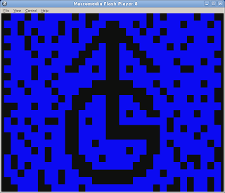
Finished Transition in Flash Player
Once I had the Granada transition, I decided it would be a shame not to put it to some kind of use, so I decided to recreate a Granada closedown from the mid-80s. I had a recording of a Granada closedown in another ancient RealVideo file and luckily I only needed two extra items - the Granada computer generated station clock and the Granada computer generated ident caption.
I was lucky enough to have some excellent source material for the Granada station clock - the output of the actual clock generator itself courtesy of Greg Taylor. Having the clock output also allowed me to get the RGB values of the actual colours exported by the electronics used to generate the clock and caption. Looking at off-air recordings of the clock and caption in use, I reckon these were often tweaked a bit in the gallery to make them a more Granada-ish powdery blue.
The clock itself was an interesting job. A couple of years ago I would have drawn and animated the entire thing in Flash 8. However, I did a mix and match for this. I drew the bottom of the clock with the Granada Giro G and namestyle in Inkscape 0.47. Then I exported the result as an EPS, imported the EPS into Flash 8 and then drew and animated the clock face itself.

Clock base created in Inkscape 0.47...
I was quite pleased with this - it meant I could use the best tool for each bit of the job. Inkscape is far more suited to drawing logos and lettering, whereas Flash is far more suited to both drawing and animating things like clock faces.

... and finished off in Flash 8
The clock was a pretty quick job, polished off in under an hour from start to finish.

Inkscaped Granada CGI ident
The Granada electronic caption was another quick job, as I had a large, high quality scan of a genuine caption card from Matthew Gulliver's collection to work from. This caption dated from the same era as the closedown and the proportions of both the logo and lettering were identical.
Once I had all the bits and pieces I stuck them together in Flash 8 and exported the resulting sequence as a PNG sequence. I turned the PNG sequence into an uncompressed AVI file using VirtualDub. Then I imported to AVI file into Avidemux to add audio and export the result as an H.264 video/MP3 audio MP4 file.
I uploaded the finished result to my YouTube channel, and here it is:
Sunday, September 12, 2010
Probably The Ugliest Test Card In The World
When I drew my recreation of the IBA electronic test-card ETP-1 in Macromedia Flash, I only captioned it with the large IBA caption. As I only needed the card to recreate an HTV start-up sequence, I never bothered adding the two best known captions that appeared on the card - for Channel Four and S4C.

This always annoyed me, so whilst I was listening to a podcast this morning I finally decided to finish it off. I used Inkscape to draw the lettering - I'll export it as an EPS file for import into Macromedia Flash at a later date.

If you enlarge the image below, you will see that letter is designed on a 10 x 10 pixel grid, with 2 pixel leading between each letter.

Now all I need to is some KPM tracks by Keith Mansfield and I'm back in the early 80s again.

IBA ETP1 recreated in Macromedia Flash 8
This always annoyed me, so whilst I was listening to a podcast this morning I finally decided to finish it off. I used Inkscape to draw the lettering - I'll export it as an EPS file for import into Macromedia Flash at a later date.

Beautiful calligraphic script
If you enlarge the image below, you will see that letter is designed on a 10 x 10 pixel grid, with 2 pixel leading between each letter.

Snap to Grid and Clone Object are your friends
Now all I need to is some KPM tracks by Keith Mansfield and I'm back in the early 80s again.
Tuesday, September 07, 2010
Distractions...
My children have been nagging me to add internationalisation (i18n) to testpilotmonkey's brilliant game ClapTraps.
Well, the road to good intentions - I got distracted and ended up designing a level.

It was supposed to be very cerebral and contain Repton style apple and grass puzzles but ended up as something to rival Giant Clam in Repton 1. Now, better get back to adding some Magyar to ClapTraps before my daughters get back from school today or they won't be amused!
Well, the road to good intentions - I got distracted and ended up designing a level.

Not bad for a first attempt
It was supposed to be very cerebral and contain Repton style apple and grass puzzles but ended up as something to rival Giant Clam in Repton 1. Now, better get back to adding some Magyar to ClapTraps before my daughters get back from school today or they won't be amused!
Sunday, September 05, 2010
Showing Off
Well, I've had Prof. Steve Furber giving lectures in front of my artwork, now I've got the legendary Sophie Wilson playing with robot arms next to it.

The event was the Vintage Computer Fesitval, which was held on the 19-20th June at The National Museum of Computing in Bletchley Park.

The artwork, a long banner, was produced for R3PLAY - an computer exhibition which is going to be held on the 6-7 November in Blackpool. I've spent a lot of time on various bits and pieces for this event this year.

The extremely striking R3PLAY logo was originally designed as a raster image by Darren Doyle - better known as "Greyfox". I just about managed, using Inkscape, to reproduce this image in vector format so it could be blown up to enormous sizes for use on banners and posters.

The hardest part of vectorising the logo was reproducing the faint images of flags that are superimposed on the lettering - I had to trace these by hand and it was a long and quite fiddly job - particularly because the effect of the flags is quite subtle.

I also had a problem getting the Inkscape filters to superimpose "raster" lines on top of the lettering. I ended up having to superimpose filtered stripes on top of each other several times.

The raster lines themselves are squashed ellipses in a layer with the "Screen" blend mode enabled so that they make the layers underneath them lighter.

The final challenge was getting the red glow around the letters correct. Again, this involved layering several filtered copies of the lettering on top of each other, and it was quite a struggle to get it just right. However, the glows scale unpredictably, which means reworking them every time I resize the logo.
Underneath the logo were vector images I created in Inkscape by tracing photographs I managed to find using Google images. Tracing vector computers is a very straightforward job, and quite a pleasant one provided you have some music to listen to. The only hard part is matching fonts, and even that is easy if you have a Letraset catalogue from the seventies!
Not all the vectors I produced were used. For instance, here is my Acorn Electron:

One trick I used when doing this sort of thing is to make good use of the Inkscape Perspective plug-in to map square on views onto a parallelogram.
The pixel artwork at the bottom of the banner was produced by the world renowned pixel artist Gary Lucken (aka Army of Trolls).

In order to produce magazine advertisements from this artwork I did have to extend it slightly horizontally in The GIMP - I did it by copying elements form Gary's design - I even manage to incorporate the BBC Computer Literacy Project's owl.

Once I had created this expanded version of the artwork I set about creating the artwork for the adverts that appeared in retroGAMER* and gamesTM magazine. This was quite nerve wracking - to be honest I haven't been so nervous since I was first did graphics to be broadcast on television.
After much experimentation I decided on the 50s font Microgramma to be the "corporate font" for R3PLAY. I like the font, it looks both retro and modern and it was also the Commodore font from the early 80s.

I also produced an A5 version for fliers - Dave Moore is one of the masterminds behind the R3PLAY event, and shamelessly uses the fliers for promoting the show at every opportunity.
So my flier was stuck to Daleks....

And brandished by attractive young ladies...

Another early job was creating the tickets for the event. Again, another Inkscape job for a huge print run which I always find nerve wracking. I recreated both the Macmillan logo and the National Museum of Computing logo as vector images as I didn't have vector copies.

The tickets looked rather striking in the end, but Dave Moore told me had to bin the whole of the first print run of tickets and have them reprinted elsewhere in order to do them justice.
The final graphics for the adverts, fliers and tickets were exported as enormous TIFF files. However for things like the roll-up banners I had to produce PDF files. I found the best way to do this from Inkscape was to Print To PDF, rather than export to PDF from Inkscape. The latter method produces absoltuely terrible results, where as printing to PDF produces results which are flawless.
R3PLAY is organised by the non-profit organisation the Computing and Gaming Events Union (CGEU), and I was also responsible for tarting up their logo. The original was again designed by Darren Doyle. I placed it in a roundel, made the Pac-Man image a vector shape and added some depth to him and finally added some lettering in Inkscape:

One of my main jobs for the R3PLAY event was producing its website. In order to "save time" we decided to use Joomla and base the design of the website on an existing Joomla template from a commercial supplier who shall remain nameless.

This was a very frustrating experience as there were numerous bugs and several unfinished bits and pieces in the template we purchased and I ended up having to get rapidly expert in PHP and CSS in order to get the thing working as required. There were also no useful Photoshop templates for the artwork, so I ended up having to recreate all the source files for the graphics in The GIMP from scratch.
Obviously this was all good practice for me but not what you want when you are working against a deadline for a very exacting customer!
One of my favourite jobs on the website was producing the animated Pac-Man gif that is displayed about the advert on the home page.

To do this I took several screenshots from version 1 of Acornsoft Snapper in Tom Walker's excellent BBC Micro emulator B-Em, traced the sprites and animated them in Macromedia Flash 8 and then exported the result from Flash as an animated GIF.

R3PLAY looks like being an absolutely fantastic show, and well worth a visit if you can make it. Besides which, by attending you will be helping to raise money for two very worthy causes - Macmillan Cancer Support and The National Museum of Computing.
It has three strands - Consoles, Coin-Op games (including Pin-Ball) and Computers. The latter includes a strong retro contingent of the well known names such as BBC Micros, Electrons, Archimedes as well as the more obscure things such as Commodore 64s, Amigas, STs and ZX Spectrums.

Sophie's choice
The event was the Vintage Computer Fesitval, which was held on the 19-20th June at The National Museum of Computing in Bletchley Park.

Nice banner, shame about the carpet.
The artwork, a long banner, was produced for R3PLAY - an computer exhibition which is going to be held on the 6-7 November in Blackpool. I've spent a lot of time on various bits and pieces for this event this year.

R3PLAY vectorised - click to enlarge
The extremely striking R3PLAY logo was originally designed as a raster image by Darren Doyle - better known as "Greyfox". I just about managed, using Inkscape, to reproduce this image in vector format so it could be blown up to enormous sizes for use on banners and posters.

Outlined - click to enlarge
The hardest part of vectorising the logo was reproducing the faint images of flags that are superimposed on the lettering - I had to trace these by hand and it was a long and quite fiddly job - particularly because the effect of the flags is quite subtle.

Flags of all nations - click to enlarge
I also had a problem getting the Inkscape filters to superimpose "raster" lines on top of the lettering. I ended up having to superimpose filtered stripes on top of each other several times.

Stripes - just squashed ellipses
The raster lines themselves are squashed ellipses in a layer with the "Screen" blend mode enabled so that they make the layers underneath them lighter.

Five layers of outline with glow filter stacked
The final challenge was getting the red glow around the letters correct. Again, this involved layering several filtered copies of the lettering on top of each other, and it was quite a struggle to get it just right. However, the glows scale unpredictably, which means reworking them every time I resize the logo.
Underneath the logo were vector images I created in Inkscape by tracing photographs I managed to find using Google images. Tracing vector computers is a very straightforward job, and quite a pleasant one provided you have some music to listen to. The only hard part is matching fonts, and even that is easy if you have a Letraset catalogue from the seventies!
Not all the vectors I produced were used. For instance, here is my Acorn Electron:

The thinking man's ZX Spectrum
One trick I used when doing this sort of thing is to make good use of the Inkscape Perspective plug-in to map square on views onto a parallelogram.
The pixel artwork at the bottom of the banner was produced by the world renowned pixel artist Gary Lucken (aka Army of Trolls).

A Gary Lucken masterpiece...
In order to produce magazine advertisements from this artwork I did have to extend it slightly horizontally in The GIMP - I did it by copying elements form Gary's design - I even manage to incorporate the BBC Computer Literacy Project's owl.

...ruined by me. Sorry.
Once I had created this expanded version of the artwork I set about creating the artwork for the adverts that appeared in retroGAMER* and gamesTM magazine. This was quite nerve wracking - to be honest I haven't been so nervous since I was first did graphics to be broadcast on television.
After much experimentation I decided on the 50s font Microgramma to be the "corporate font" for R3PLAY. I like the font, it looks both retro and modern and it was also the Commodore font from the early 80s.

Finished Flyer - lots of Microgramma
I also produced an A5 version for fliers - Dave Moore is one of the masterminds behind the R3PLAY event, and shamelessly uses the fliers for promoting the show at every opportunity.
So my flier was stuck to Daleks....

Stupid tin boxes...
And brandished by attractive young ladies...

Edward Bernays has nothing on Dave M

Tickets, please...
The tickets looked rather striking in the end, but Dave Moore told me had to bin the whole of the first print run of tickets and have them reprinted elsewhere in order to do them justice.
The final graphics for the adverts, fliers and tickets were exported as enormous TIFF files. However for things like the roll-up banners I had to produce PDF files. I found the best way to do this from Inkscape was to Print To PDF, rather than export to PDF from Inkscape. The latter method produces absoltuely terrible results, where as printing to PDF produces results which are flawless.
R3PLAY is organised by the non-profit organisation the Computing and Gaming Events Union (CGEU), and I was also responsible for tarting up their logo. The original was again designed by Darren Doyle. I placed it in a roundel, made the Pac-Man image a vector shape and added some depth to him and finally added some lettering in Inkscape:

CGEU logo tarted up
One of my main jobs for the R3PLAY event was producing its website. In order to "save time" we decided to use Joomla and base the design of the website on an existing Joomla template from a commercial supplier who shall remain nameless.

This was a very frustrating experience as there were numerous bugs and several unfinished bits and pieces in the template we purchased and I ended up having to get rapidly expert in PHP and CSS in order to get the thing working as required. There were also no useful Photoshop templates for the artwork, so I ended up having to recreate all the source files for the graphics in The GIMP from scratch.
Obviously this was all good practice for me but not what you want when you are working against a deadline for a very exacting customer!
One of my favourite jobs on the website was producing the animated Pac-Man gif that is displayed about the advert on the home page.

Snapper is nothing like Pac-Man, honest.
To do this I took several screenshots from version 1 of Acornsoft Snapper in Tom Walker's excellent BBC Micro emulator B-Em, traced the sprites and animated them in Macromedia Flash 8 and then exported the result from Flash as an animated GIF.

I produced a forum Post footer too
R3PLAY looks like being an absolutely fantastic show, and well worth a visit if you can make it. Besides which, by attending you will be helping to raise money for two very worthy causes - Macmillan Cancer Support and The National Museum of Computing.
It has three strands - Consoles, Coin-Op games (including Pin-Ball) and Computers. The latter includes a strong retro contingent of the well known names such as BBC Micros, Electrons, Archimedes as well as the more obscure things such as Commodore 64s, Amigas, STs and ZX Spectrums.
Monday, August 23, 2010
Take You To My Leaders
Well, it had to happen sooner or later. My first documentary - my entry for the Golden Spigot of Hinton St. George:
It's poorly made, factually dubious, and won't tell you anything worth knowing - just like the real ones on the telly!
It's poorly made, factually dubious, and won't tell you anything worth knowing - just like the real ones on the telly!
Saturday, August 14, 2010
Mogrifying
When I'm using video as a source material for a recreation, I often use Avidemux. Avidemux will either export .bmp files or .jpg files.

I like to export .bmp files from Avidemux as they are lossless. However, they are also very large and I usually want to convert them to .png files to save space. To do this using a graphics package would be boring, time consuming and prone to error.
Luckily I'm able to use a handy little free software utility called ImageMagick from the GNU/Linux command line. It has a command called mogrify to do this sort of job.
To convert all the bmp files in a directory to png files I simply use:
mogrify -format png *.bmp
And then to remove the original bmp files I can use:
rm *.bmp
And the finished result:

This has saved me literally hours of work over the past few months.

Exporting from Avidemux - limited options
I like to export .bmp files from Avidemux as they are lossless. However, they are also very large and I usually want to convert them to .png files to save space. To do this using a graphics package would be boring, time consuming and prone to error.
Luckily I'm able to use a handy little free software utility called ImageMagick from the GNU/Linux command line. It has a command called mogrify to do this sort of job.
To convert all the bmp files in a directory to png files I simply use:
mogrify -format png *.bmp
And then to remove the original bmp files I can use:
rm *.bmp
And the finished result:

Mogrified!
This has saved me literally hours of work over the past few months.
Wednesday, August 04, 2010
ClapTraps v1.1
You might remember that in April I blogged about the computer game ClapTraps, which was written by my friend testpilotmonkey. ClapTraps is a fiendishly addictive puzzle game written in Python using the PyGame SDL library.

Back in May I also blogged about my Inkscape reworking of the graphics for the game.

Since then testpilotmonkey has released a new, expanded version of the game - ClapTraps v1.1. It includes my reworked graphics and a number of new features.
For instance, you can now redefine the control keys. This is very useful if you, like me, have a Hungarian keyboard!
Even better, people who can code in Python can easily change the behaviour the game objects, just as you can in Repton Infinity. To demonstrate this, ClapTraps comes with a XOR-style came called Arrows which has the potential to be very interesting indeed.

Despite my best efforts to recommend the game to everyone I know, ClapTraps has been largely ignored, even by fans of Repton. I think this is inexplicable and a crying shame. It's an absolutely fantastic puzzle game and has given me and my daughters a lot of fun. It's free as in beer and free as in freedom so there is no reason not to download it and have a go - and let testpilotmonkey know what you think too!
It is available to download for Windows, GNU/Linux and OS X here.
NB for GNU/Linux users: I found I couldn't run the ClapTraps code by double clicking on the main ClapTraps.py icon from Nautilus, the GNOME file browsing program. After much experimentation I found the problem was simply that ClapTraps.py was corrupted in some way. If you copy and paste its contents into a new file it will work correctly. The copy and pasted file will be 2K shorter than the original, but work perfectly.

ClapTraps v1.1 - reworked title screen
Back in May I also blogged about my Inkscape reworking of the graphics for the game.

ClapTraps v1.1 - reworked graphics
Since then testpilotmonkey has released a new, expanded version of the game - ClapTraps v1.1. It includes my reworked graphics and a number of new features.
For instance, you can now redefine the control keys. This is very useful if you, like me, have a Hungarian keyboard!
Even better, people who can code in Python can easily change the behaviour the game objects, just as you can in Repton Infinity. To demonstrate this, ClapTraps comes with a XOR-style came called Arrows which has the potential to be very interesting indeed.

Arrows - a real head scratcher
Despite my best efforts to recommend the game to everyone I know, ClapTraps has been largely ignored, even by fans of Repton. I think this is inexplicable and a crying shame. It's an absolutely fantastic puzzle game and has given me and my daughters a lot of fun. It's free as in beer and free as in freedom so there is no reason not to download it and have a go - and let testpilotmonkey know what you think too!
It is available to download for Windows, GNU/Linux and OS X here.
NB for GNU/Linux users: I found I couldn't run the ClapTraps code by double clicking on the main ClapTraps.py icon from Nautilus, the GNOME file browsing program. After much experimentation I found the problem was simply that ClapTraps.py was corrupted in some way. If you copy and paste its contents into a new file it will work correctly. The copy and pasted file will be 2K shorter than the original, but work perfectly.
Thursday, July 29, 2010
(Yet) another version of Letraset Oxford
Whilst browsing dafont.com the other day, I noticed that (yet) another version of the classic Letraset Oxford typeface has been created, and this time it's another free (as in freedom) version.
The font is named Oxford-CP and was created by Diogene. It's licensed under the GPL with the font exception rather than the SIL OFL which I used to license my version.
The non-free version of Oxford, called Sportowy, which boasts some beautiful glyphs for things like @, is available here.
My version, which I called "Scene" in honour of the BBCtv schools programme that used the face for its logo, also features capital letters and Central European accenting and is available to download from here.

Ironically, after the huge amount of effort I put into creating it (see here, here and here), I still haven't actually done anything with my Scene font - but hopefully I'll get around to doing something with it soon.
The font is named Oxford-CP and was created by Diogene. It's licensed under the GPL with the font exception rather than the SIL OFL which I used to license my version.
The non-free version of Oxford, called Sportowy, which boasts some beautiful glyphs for things like @, is available here.
My version, which I called "Scene" in honour of the BBCtv schools programme that used the face for its logo, also features capital letters and Central European accenting and is available to download from here.

BBC Micro game Pipeline used Oxford
Ironically, after the huge amount of effort I put into creating it (see here, here and here), I still haven't actually done anything with my Scene font - but hopefully I'll get around to doing something with it soon.
Saturday, July 17, 2010
Let's Go Nationwide
Recently I've been playing about recreating various SMPTE and custom made film leaders in Flash 8 and Inkscape. One of the most interesting for me, and one that reminds me of Blue Peter for some reason, is the BBC's own film leader. Here it is:
While working on film leaders, I've settled upon a hybrid Flash/Inkscape workflow in which I create the individual frames in Inkscape as Inkscape SVG files.

While working on film leaders, I've settled upon a hybrid Flash/Inkscape workflow in which I create the individual frames in Inkscape as Inkscape SVG files.

SMPTE Society Leader frames created as SVG files
I then export them all as EPS (Encapsulated PostScript) files so they can be imported into Macromedia Flash 8. You could export all the files from Inkscape by hand, but to save time I use a little Bash shell script instead:
#!/bin/bash
#
# Export all SVG files in a directory as EPS files

for i in *.svg; do
    inkscape $i --export-eps `basename $i .svg`".eps"

done
Then I import the EPS files into Flash and I'm ready to start putting the animation together.
Friday, June 25, 2010

Thursday, June 24, 2010
Diamonds are for 1 minute 58 seconds
I've always had a fascination for the BBC schools diamond. In case you are not familiar with it, the BBC schools diamond was a mechanical model devised by Murray Andrew for use in the last two minutes of intervals before BBC programmes for schools and colleges.
I am ancient enough not only to remember it, but to have watched it as nature intended at primary school every week before a programme. I was always mesmerised by it, but my unimpressed teachers used to complain that it wasn't as easy to understand as ITV's schools clock.
The diamond mechanism itself is fascinating and it was very satisfying to work out how it worked.

The four striped version of the diamond was originally only a static caption card, intended for use in place of the mechanical model in intervals less than two minutes in length.
I always wanted to see it being animated. Hence another lame mock that I produced, as always, in Macromedia Flash 8.
As I'm exclusively using GNU/Linux these days I exported the diamond from Macromedia Flash 8 as a PNG sequence. I imported that into the free software video tool Avidemux, added the music and exported the resulting sequence into an MP4 container with MPEG4-AVC video encoded using the x264 video codec and MP3 audio encoded using the LAME MP3 audio codec.
I find the overall effect is rather akin to seeing one of those 4x4 or 5x5 Rubik's cubes for the first time.
I am ancient enough not only to remember it, but to have watched it as nature intended at primary school every week before a programme. I was always mesmerised by it, but my unimpressed teachers used to complain that it wasn't as easy to understand as ITV's schools clock.
The diamond mechanism itself is fascinating and it was very satisfying to work out how it worked.

The diamond animation as outlines in Flash
The four striped version of the diamond was originally only a static caption card, intended for use in place of the mechanical model in intervals less than two minutes in length.
I always wanted to see it being animated. Hence another lame mock that I produced, as always, in Macromedia Flash 8.
As I'm exclusively using GNU/Linux these days I exported the diamond from Macromedia Flash 8 as a PNG sequence. I imported that into the free software video tool Avidemux, added the music and exported the resulting sequence into an MP4 container with MPEG4-AVC video encoded using the x264 video codec and MP3 audio encoded using the LAME MP3 audio codec.
I find the overall effect is rather akin to seeing one of those 4x4 or 5x5 Rubik's cubes for the first time.
Anchor Cliff Michelmore
Regular readers of this blog will no doubt have been bored witless by my endless posts about the creation of a TrueType font based on the output produced by the BBC analogue character generation system Anchor.
Although I was very happy with the end result, I was aware that when compared to one famous example - the BBC's coverage of the General Election of 1970 - it didn't look quite right.
Here is an example image taken from this video - apologies in advance, as the quality is appalling:

The characters looked fatter - squarer - than they did on my version. I was curious to know why.
Whilst browsing the internet for something else entirely I happened to come across a BBC .pdf file from January 1973 that explained what was going on:

And here is how it would look after January 1973:

And here is a gratuitous picture of Cliff Michelmore as, personally, I think you can't have too much Cliff Michelmore on your blog:

So, imagine you are doing something with Anchor.ttf on a 720 x 576 image that is supposed to be from pre-1973. In that case use Anchor at 41pt, stretched horizontally by 128% with 85% line spacing. And you mustn't use any lower case!
If you are doing something with Anchor.ttf on a 720 x 576 image that is supposed to be from post-1973 then simply use it at 41pt with 100% line spacing.
Although I was very happy with the end result, I was aware that when compared to one famous example - the BBC's coverage of the General Election of 1970 - it didn't look quite right.
Here is an example image taken from this video - apologies in advance, as the quality is appalling:

Anchor used in anger, 1970
The characters looked fatter - squarer - than they did on my version. I was curious to know why.
Whilst browsing the internet for something else entirely I happened to come across a BBC .pdf file from January 1973 that explained what was going on:
"The addition of the lower-case facility has involved a change in the format of the display from 14 rows of 25 characters to 12 rows of 32 characters. This has been necessary to accommodate the descenders of such characters as 'y' and 'g' whilst preserving the appearance of the character set." BBC Engineering Design Information - 10168(1).JAN73.ECG.So, here is how Anchor would look before January 1973:

Anchor, pre January 1973
And here is how it would look after January 1973:

Anchor, post Jan 73
And here is a gratuitous picture of Cliff Michelmore as, personally, I think you can't have too much Cliff Michelmore on your blog:

Click to enlarge
So, imagine you are doing something with Anchor.ttf on a 720 x 576 image that is supposed to be from pre-1973. In that case use Anchor at 41pt, stretched horizontally by 128% with 85% line spacing. And you mustn't use any lower case!
If you are doing something with Anchor.ttf on a 720 x 576 image that is supposed to be from post-1973 then simply use it at 41pt with 100% line spacing.
Wednesday, June 16, 2010
Inkscape to Flash 8
These days, if at all possible, I like to use Inkscape for creating vector artwork. At one time I used Macromedia Flash 8 for all my vector illustration work. But these days, if I have to create artwork in Flash it makes me feel like I'm being forced to write with my left hand.
There are also a number of things I can achieve easily in Inkscape that are harder to do in Flash. One recent example was when I was working on the animated menu for Simon Buckley's new website. I was given a signed off design as a bitmap illustration and was asked to turn the design into a vector animation in Macromedia Flash format.
Most of the design was very straightforward to achieve, but there was one part that was more fiddly. The name of the website was written in a font called Chalkdust, and it was fringed with a thick black outline. This is one of those things that looks simple to do until you actually try and do it in Flash.
The way I tackled getting an attractive vector outline for the Chalkdust text was to enter the Chalkdust text into Inkscape, turn the text into vector outlines and then use the Inkscape "Linked Offset" option to enable me to expand the text outline to the desired extent.

Chalkdust, like most typefaces, has very messy vector outlines with large amount of redundant nodes. This meant that the resulting expanded outline needed a lot of cleaning up and simplification - a job I could do very quickly with the node tool in Inkscape.
It's always worth making your vector outlines as clean as possible. In the old days of dial-up modems this was because you hand to shave every last byte off of download times - I used to hand optimise everything I did in Flash to get Flash animations within bandwidth quotas set by customers. However these days it's because the more elegant your outline the better it looks (due to the vagaries of anti-aliasing routines) and the better it animates.

The finished outline was soon cleaned up and ready for transferring from Inkscape 0.47 to Flash 8.
After some experimenting, I found that my favoured method of transferring vector Inkscape artwork into Macromedia Flash 8 is the Encapsulated Postscript or EPS format.
There is one important thing to be aware of when transferring between the two programs using this format. Take this Inkscape vector drawing as an example - it's 400 by 400 pixels in size.

When imported into Macromedia Flash as an EPS it arrives as a vector drawing 320 by 320 pixels in size.

There is absolutely no way around this - Flash thinks EPS files should be 72dpi, Inkscape thinks EPS files should be 90dpi and neither program lets you do anything about it.
However, it's simple enough to use the Flash 8 Transform panel to scale all the EPS files you import into it by 125% to make up for the difference in dpi between the two packages.

One final point to bear in mind with EPS transfers between Inkscape and Flash 8 - avoid gradient fills. These always seem to be imported as bitmaps in Flash 8. You will have to recreate any Inkscape fills again from scratch in Macromedia Flash so I never bother creating them in Inkscape in the first place.
The finished animated menu can be seen here. I've also written a blog post about my preferred method of getting my vector drawings from Flash 8 into Inkscape here.
There are also a number of things I can achieve easily in Inkscape that are harder to do in Flash. One recent example was when I was working on the animated menu for Simon Buckley's new website. I was given a signed off design as a bitmap illustration and was asked to turn the design into a vector animation in Macromedia Flash format.
Most of the design was very straightforward to achieve, but there was one part that was more fiddly. The name of the website was written in a font called Chalkdust, and it was fringed with a thick black outline. This is one of those things that looks simple to do until you actually try and do it in Flash.
The way I tackled getting an attractive vector outline for the Chalkdust text was to enter the Chalkdust text into Inkscape, turn the text into vector outlines and then use the Inkscape "Linked Offset" option to enable me to expand the text outline to the desired extent.

Cleaning up Chalkdust in Inkscape
Chalkdust, like most typefaces, has very messy vector outlines with large amount of redundant nodes. This meant that the resulting expanded outline needed a lot of cleaning up and simplification - a job I could do very quickly with the node tool in Inkscape.
It's always worth making your vector outlines as clean as possible. In the old days of dial-up modems this was because you hand to shave every last byte off of download times - I used to hand optimise everything I did in Flash to get Flash animations within bandwidth quotas set by customers. However these days it's because the more elegant your outline the better it looks (due to the vagaries of anti-aliasing routines) and the better it animates.

Cleaned up outline
The finished outline was soon cleaned up and ready for transferring from Inkscape 0.47 to Flash 8.
After some experimenting, I found that my favoured method of transferring vector Inkscape artwork into Macromedia Flash 8 is the Encapsulated Postscript or EPS format.
There is one important thing to be aware of when transferring between the two programs using this format. Take this Inkscape vector drawing as an example - it's 400 by 400 pixels in size.

400 x 400 pixel Inkscape drawing...
When imported into Macromedia Flash as an EPS it arrives as a vector drawing 320 by 320 pixels in size.

...becomes 320 x 320 pixel Flash drawing.
There is absolutely no way around this - Flash thinks EPS files should be 72dpi, Inkscape thinks EPS files should be 90dpi and neither program lets you do anything about it.
However, it's simple enough to use the Flash 8 Transform panel to scale all the EPS files you import into it by 125% to make up for the difference in dpi between the two packages.

Doing this becomes automatic after a while!
One final point to bear in mind with EPS transfers between Inkscape and Flash 8 - avoid gradient fills. These always seem to be imported as bitmaps in Flash 8. You will have to recreate any Inkscape fills again from scratch in Macromedia Flash so I never bother creating them in Inkscape in the first place.
The finished animated menu can be seen here. I've also written a blog post about my preferred method of getting my vector drawings from Flash 8 into Inkscape here.
Tuesday, June 15, 2010
Font Embedding - Better (12 Years) Late Than Never
Twelve years ago, when the internet was all shiny and new and I hadn't even heard of GNU/Linux, one of my favourite websites was the Microsoft typography website. One of the things I remember reading about on the site was a tool called WEFT (Web Embedding Fonts Tool). WEFT allowed you to embed fonts on your websites. This meant they were not restricted to using the fonts someone had installed on their computer, but could use any font you wanted. As someone who suffers from projectile vomiting at the merest glance of Comic Sans I immediately put trying out WEFT on my to-do list. And then forgot all about it.
Over a decade later I was reading the press release for Mozilla Firefox 3.6 and noticed that font embedding was about to re-enter the limelight. Mozilla Firefox 3.6 includes a support for a very similar system to WEFT for embedding fonts on web pages. It's called WOFF. So, being as curious and nosey as ever I thought I would investigate using WOFF.
But where to start? It turned out that from deciding to create a web-page using WOFF to the finished article took me the best part of a day of messing around, browsing, compiling tarballs and experimenting.
I decided I'd create a very simple web-page using one of my own fonts, Anchor. This is because there are a number of irritating legal issues around font embedding for web pages. In order to be able to embed a font on a website you have to have a licence to do this. The issues are explained very well in this article by Armand Niculescu.
Once I'd decided on a font, the next job was to create a WOFF file from Anchor. There are many reasons that you would want to use a WOFF file for font embedding rather than have your web-page link to your original font file. For instance a WOFF file is compressed, which saves download time. In addition, a WOFF file can contain only a subset of the characters or glyphs in a font that you actually use on your site which again can save a lot of download time on a site that uses several fonts.
Sadly, the simplest way to do this on GNU/Linux was download a windows binary file (an .exe file) and run it via WINE. WINE is a compatibility layer that allows you to run binary files intended for use on Microsoft Windows on GNU/Linux.
The tool I needed to run to convert font files to WOFF files is called sfnt2woff and I found some very good instructions on how to run and use this tool on Federico Moretti's blog. After creating my WOFF file, I could then incorporate it into a web page using the CSS @font-face declaration. All seemed to work well in Firefox 3.6 when I tested the resulting .html file from my local drive.

However, when I was looking at Armand's Niculescu's blog entry again I realised that was not enough to ensure compatibility with most browsers. However, if I included a few more formats alongside my WOFF file, I could get the embedded fonts on my page working for 92% of browsers - which sounded good to me.
In order to make my web page work on the majority of web browsers I would also need to add a @font-face declaration that linked to a copy of my original TrueType font (.ttf) file for older versions of Firefox and the Opera, Safari and Chrome browsers.
In addition, to be on the safe side, I really needed to include an SVG font version of the font for use with the Safari and Chrome browsers. Creating an SVG version was simplicity itself. As I created the most recent version of the Anchor font in the free software tool FontForge, all I needed to do was use FontForge to export an .svg version of the Anchor font.

SVG font created sucessfully there was one more format I needed to create - a Microsoft EOT file. An EOT file does exactly the same job as a WOFF file on Microsoft browsers. As WOFF is only going to be supported in Microsoft Internet Explorer 9 and later, for a site to work on Microsoft Internet Explorer 4-8 I'd need to create a EOT file.
My initial thought for creating a EOT file was to download WEFT from the Microsoft website and use that via WINE. However this failed miserably. But, as a consolation, I found that even Windows users found Microsoft's WEFT tool elderly, unintuitive and almost impossible to use.
Fortunately I found another tool on the internet - it was called ttf2eot and it claimed to do exactly what its name suggests. The bad news (simply because I'm lazy) was that the tool was a piece of C++ source code. That meant I had to download the build-essentials package and compile a binary myself. It took all of two minutes - such hardship!
Anyway, the file compiled beautifully and the tool worked first time. One line in the terminal (the tool needs the angle brackets around the source font filename):
./ttf2eot <Anchor.ttf> Anchor.eot
Was enough to create an eot file. The only thing that I found rather odd was my finished EOT file was bigger than the original TrueType font file!
So, I added all the formats into my @font-face declaration, tested the file locally and it worked. So triumphantly I uploaded my finished html file, along with my ttf, svg, woff and eot to my webspace using gFTP. And it failed miserably.

Uploaded to my webspace - massive fail
Here was my CSS:
@font-face {
font-family: 'Anchor';
src: url('Anchor.eot');
src: url("Anchor.woff") format("woff"),
src: url("Anchor.ttf") format("truetype"),
src: url("Anchor.svg#anchor") format("svg");
}
I couldn't understand why it failed - I thought I'd done everything correctly. But fortunately I had come across an excellent article by Paul Irish that explained exactly where I was going wrong. There are a whole host of gotchas with font embedding, and the order of statements in the CSS declaration is critical:
@font-face {
font-family: 'Anchor';
src: url('Anchor.eot');
src: local('☺'),
url("Anchor.woff") format("woff"),
url("Anchor.ttf") format("truetype"),
url("Anchor.svg#anchor") format("svg");
}
Was the only order that would get the @font-face statement to behave.

Success at last!
And then... And then... ...I found out that I needn't of bothered. A website called Font Squirrel has a nice tool that does everything for you plus more. In particular, it creates subsets of fonts for you so you can cut down on your file sizes and download times. You just need to specify the glyphs (characters) in your .ttf, .eot, .woff and .svg files that you actually use.
Font Squirrel also have loads of fonts that you can legally embed, and are hand-picked to ensure they are all good quality type faces.
Another good source of information is Milton Bayer's site, which explains about the CSS and XHTML needed to get WOFF working for those that may be unfamiliar with it.
Anyway, it was fun and I learnt a lot. The end result can be seen for real in the comfort of your own browser here:
http://www.kecskebak.co.uk/woff.html
I've designed a handful of fonts that can all be freely embedded in your websites. You can get hold of them from here.
Over a decade later I was reading the press release for Mozilla Firefox 3.6 and noticed that font embedding was about to re-enter the limelight. Mozilla Firefox 3.6 includes a support for a very similar system to WEFT for embedding fonts on web pages. It's called WOFF. So, being as curious and nosey as ever I thought I would investigate using WOFF.
But where to start? It turned out that from deciding to create a web-page using WOFF to the finished article took me the best part of a day of messing around, browsing, compiling tarballs and experimenting.
I decided I'd create a very simple web-page using one of my own fonts, Anchor. This is because there are a number of irritating legal issues around font embedding for web pages. In order to be able to embed a font on a website you have to have a licence to do this. The issues are explained very well in this article by Armand Niculescu.
Once I'd decided on a font, the next job was to create a WOFF file from Anchor. There are many reasons that you would want to use a WOFF file for font embedding rather than have your web-page link to your original font file. For instance a WOFF file is compressed, which saves download time. In addition, a WOFF file can contain only a subset of the characters or glyphs in a font that you actually use on your site which again can save a lot of download time on a site that uses several fonts.
Sadly, the simplest way to do this on GNU/Linux was download a windows binary file (an .exe file) and run it via WINE. WINE is a compatibility layer that allows you to run binary files intended for use on Microsoft Windows on GNU/Linux.
The tool I needed to run to convert font files to WOFF files is called sfnt2woff and I found some very good instructions on how to run and use this tool on Federico Moretti's blog. After creating my WOFF file, I could then incorporate it into a web page using the CSS @font-face declaration. All seemed to work well in Firefox 3.6 when I tested the resulting .html file from my local drive.

Success - my .woff works locally
However, when I was looking at Armand's Niculescu's blog entry again I realised that was not enough to ensure compatibility with most browsers. However, if I included a few more formats alongside my WOFF file, I could get the embedded fonts on my page working for 92% of browsers - which sounded good to me.
In order to make my web page work on the majority of web browsers I would also need to add a @font-face declaration that linked to a copy of my original TrueType font (.ttf) file for older versions of Firefox and the Opera, Safari and Chrome browsers.
In addition, to be on the safe side, I really needed to include an SVG font version of the font for use with the Safari and Chrome browsers. Creating an SVG version was simplicity itself. As I created the most recent version of the Anchor font in the free software tool FontForge, all I needed to do was use FontForge to export an .svg version of the Anchor font.

FontForge 2.0 File Export Dialogue box
SVG font created sucessfully there was one more format I needed to create - a Microsoft EOT file. An EOT file does exactly the same job as a WOFF file on Microsoft browsers. As WOFF is only going to be supported in Microsoft Internet Explorer 9 and later, for a site to work on Microsoft Internet Explorer 4-8 I'd need to create a EOT file.
My initial thought for creating a EOT file was to download WEFT from the Microsoft website and use that via WINE. However this failed miserably. But, as a consolation, I found that even Windows users found Microsoft's WEFT tool elderly, unintuitive and almost impossible to use.
Fortunately I found another tool on the internet - it was called ttf2eot and it claimed to do exactly what its name suggests. The bad news (simply because I'm lazy) was that the tool was a piece of C++ source code. That meant I had to download the build-essentials package and compile a binary myself. It took all of two minutes - such hardship!
Anyway, the file compiled beautifully and the tool worked first time. One line in the terminal (the tool needs the angle brackets around the source font filename):
./ttf2eot
Was enough to create an eot file. The only thing that I found rather odd was my finished EOT file was bigger than the original TrueType font file!
So, I added all the formats into my @font-face declaration, tested the file locally and it worked. So triumphantly I uploaded my finished html file, along with my ttf, svg, woff and eot to my webspace using gFTP. And it failed miserably.

@font-face {
font-family: 'Anchor';
src: url('Anchor.eot');
src: url("Anchor.woff") format("woff"),
src: url("Anchor.ttf") format("truetype"),
src: url("Anchor.svg#anchor") format("svg");
}
I couldn't understand why it failed - I thought I'd done everything correctly. But fortunately I had come across an excellent article by Paul Irish that explained exactly where I was going wrong. There are a whole host of gotchas with font embedding, and the order of statements in the CSS declaration is critical:
@font-face {
font-family: 'Anchor';
src: url('Anchor.eot');
src: local('☺'),
url("Anchor.woff") format("woff"),
url("Anchor.ttf") format("truetype"),
url("Anchor.svg#anchor") format("svg");
}
Was the only order that would get the @font-face statement to behave.

And then... And then... ...I found out that I needn't of bothered. A website called Font Squirrel has a nice tool that does everything for you plus more. In particular, it creates subsets of fonts for you so you can cut down on your file sizes and download times. You just need to specify the glyphs (characters) in your .ttf, .eot, .woff and .svg files that you actually use.
Font Squirrel also have loads of fonts that you can legally embed, and are hand-picked to ensure they are all good quality type faces.
Another good source of information is Milton Bayer's site, which explains about the CSS and XHTML needed to get WOFF working for those that may be unfamiliar with it.
Anyway, it was fun and I learnt a lot. The end result can be seen for real in the comfort of your own browser here:
http://www.kecskebak.co.uk/woff.html
I've designed a handful of fonts that can all be freely embedded in your websites. You can get hold of them from here.
Subscribe to:
Posts (Atom)