Showing posts with label ATV. Show all posts

Saturday, January 14, 2012

ATV Yesterday and Today

If you’ve read my blog before, you may have come across some posts about my friend Roddy Buxton. Roddy is an incredibly inventive chap – he’s rather like Wallace and Grommit rolled into one! He has his own blog these days and I find everything on it fascinating.

One of Roddy’s cracking contraptions

One of the subjects recently covered on Roddy’s blog is the home-made telecine machine he built. The telecine was a device invented by John Logie-Baird at the very dawn of broadcasting (he began work on telecine back in the 1920s) for transferring pictures from film to television.

Roddy also shares my love of everything ATV, so naturally one of the first films Roddy used to demonstrate his telecine was a 16mm film copy of the ATV Today title sequence from 1976.

This title sequence was used from 1976-1979 and proved so iconic (no doubt helped immeasurably by the rather forgetful young lady who forgot to put her dress on) it is often used to herald items about ATV on ITV Central News. Sadly, as you can see below, the sequence was not created in widescreen so it usually looks pretty odd when it’s shown these days.

How the sequence looks when broadcast these days.

The quality of Roddy’s transfer was so good I thought it really lent itself to creating a genuine widescreen version. In addition, this would provide me with a perfect opportunity to learn some more about animating using the free software animation tool Synfig Studio.

The first thing to do when attempting an animation like this is to watch the source video frame by frame and jot down a list of key-frames – the frames where something starts or stops happening. I use a piece of free software called Avidemux to play video frame by frame. Avidemux is like a Swiss Army knife for video and I find it handy for all sorts of things.

Video in Avidemux

I write key-frame lists in text file that I keep with all the other files for a project. I used to jot the key frames down on a pad, but I’ve found using a text file has two important advantages: it’s neater and I can always find it! Here is my key frame list in Gedit, which is my favourite text editor:

Key-frame list in Gedit

After I have my key-frame list I then do any experimenting I need to do if there are any parts of the sequence I’m not sure how to achieve. It’s always good to do this before you start a lot of work on graphics or animation so that you don’t waste a lot of time creating things you can’t eventually use.

The ATV Today title sequence is mostly straightforward, as it uses techniques I’ve already used in the Spotlight South-West titles I created last year. However one thing I was not too sure about was how to key video onto the finished sequence.

Usually, when I have to create video keyed onto animation I cheat. Instead of keying, I make “cut-outs” (transparent areas) in my animation. I then export my animation as a PNG32 image sequence and play any video I need underneath it. This gives a perfect, fringeless key and was the technique I used for my News At One title sequence.

However, with this title sequence things were a bit trickier – I needed two key colours, as the titles often contained two completely different video sequences keyed onto it at the same time.

Two sequences keyed at once

Therefore I had to use chromakeying in Kdenlive using the “Blue Screen” filter, something I had never had a lot of success with before.

The first part was simple – I couldn’t key two different video sequences onto two different coloured keys at once in Kdenlive. Therefore I had to key the first colour, export the video losslessly (so I would get no compression artefacts), then key the second colour.

The harder part was making the key look smooth. Digital keying is an all or nothing affair, so what you key tends to have horrible pixellated edges.

Very nasty pixel stepping on the keyed video

The solution to this problem was obvious, so it took me quite a while to hit upon it! The ATV Today title sequence is standard definition PAL Widescreen. However, if I export my animation at 1080p HD and do my keys at HD they will have much nicer rounded edges as the pixels are “smaller”. I can then downscale my video to standard definition when I’ve done my keying and get the rounded effect I was after.

Smooth keying, without pixel stepping

The other thing I found is that keying in Kdenlive is very, very sensitive. I had to do lots of test renders on short sections as there was only one “Variance” setting (on a scale between 1 and 100) that was exactly right for each colour.

So now I was convinced I could actually produce the sequence, it was time to start drawing. I created all of my images for the sequence in Inkscape, which is a free software vector graphic tool based around the SVG standard.

However, in order to produce images in Inkscape I needed to take source images from the original video to trace over. I used Avidemux to do this. The slit masks that the film sequences are keyed on to are about four screens wide, so once I had exported all the images I was interested in I needed to stitch them together in the free software image editor The GIMP. Here is an example, picked totally at random:
She'll catch her death of cold…

Back in Inkscape I realised that the sequence was based around twenty stripes, so the first thing I did before I created all the slit mask images was created guides for each stripe:

These guides saved me a lot of time

The stripes were simply rounded rectangles that I drew in Inkscape. It didn't take long to trace all of the slit masks for the title sequence. Two of the masks were repeated, which meant that I didn’t have as many graphics to create as I was fearing.

Once the slit masks were out of the way I could create the smaller items such as the logo:

ATV Today logo created in Inkscape

And, with that, all the Inkscape drawing was done. It was time to animate my drawings now, so I needed to export my Inkscape drawings into Synfig Studio. To do this I was able to use nikitakit’s fantastic new Synfig Studio SIF file Exporter plug-in for Inkscape. This does a fabulous job of enabling Inkscape artwork to be used in Synfig Studio, and it will soon be included as standard in Inkscape releases.

When I did my Spotlight title sequence I exported (saved) all of my encapsulated canvases (akin to Symbols in Flash) that I needed to reuse within my main Synfig file. This was probably because I came to Synfig from Macromedia Flash and was used to the idea of having a large file containing all the library symbols it used internally.

I have been playing with Synfig Studio a lot more since then, and I realised a far more sensible way to work was to have each of what would have been my library symbols in Flash saved as separate Synfig files. Therefore I created eight separate Synfig Studio files for each part of the sequence and created a master file that imports them all and is used to render out the finished sequence.

The project structure

This meant that my finished sequence was made up of nine very simple Synfig animation files instead of one large and complicated one.

The animation itself mainly consisted of simply animating my Inkscape slit masks across the stage using linear interpolation (i.e. a regular speed of movement).

I could type my key-frames from my key-frame text file directly into the Synfig Studio key-frame list:

Key-frames for one part of the animation

The glow was added to the ATV Today logo using a “Fast Gaussian Blur”, and the colour was changed using the “Colour Correct” layer effect – exactly the same techniques I used in the Spotlight South-West titles.

ATV Today logo in Synfig

In order to improve the rendering speed I made sure I changed the “Amount” (visibility) of anything that was not on the stage at the present time to 0 so the renderer wouldn't bother trying to render. You do this using Constant interpolation so that the value is either 0 or 1.

I had a couple of very minor problems with Synfig when I was working on this animation. One thing that confused me sometimes was the misalignment of key-frame symbol between the Properties panel and the Timeline.

This misalignment can be very confusing

As you can see above, the misalignment gets greater the further down the “Properties Panel” something appears. This makes it quite hard at times to work out what is being animated.

Some very odd Length values indeed!

Another problem I had was that the key-frame panel shows strange values in the time of length columns - particularly if you forget to set your project to 25 frames per second at the outset.

However, overall I think Synfig Studio did brilliantly, and I would chose it over Flash if I had to create this sequence again and could choose any program to create it in.

The most important technical benefit of Synfig Studio for this job was the fact that it uses floating point precision for colour, so the glows on the ATV Today logo look far better than they would have done in Flash as the colour values would not be prematurely rounded before the final render.

I rendered out my Synfig Studio animation as video via ffmpeg using the HuffyUV lossless codec, and then I was ready to move onto Kdenlive and do the keying.

Obviously I needed some “film sequences” to key into the titles, but I only have a small selection of videos as I don't have a video camera. To capture video I use my Canon Ixus 65, which records MJPEG video at 640 x 480 resolution at 30fps.

My 16mm film camera

Bizarrely, when the progressive nature of its output is coupled with the fact it produces quite noisy pictures, I’ve found this makes it a perfect digital substitute for 16mm film camera!

I “filmised” all the keyed inserts, so that when they appear in the sequence they will have been filmised twice. Hopefully, this means I’ll get something like the degradation in quality you get when a film is then transferred to another film using an optical printer.

Once the keying was done the finished sequence was filmised entirely using Kdenlive using techniques I've already discussed here.

And so, here’s the finished sequence:


Although I’m not happy about the selection of clips I’ve used, I’m delighted with the actual animation itself. I’m also very pleased that I’ve completed another project entirely using free software. However, I think the final word should go to Roddy:

Thanks for the link. I had a bit of a lump in my throat, seeing those titles scrolling across, hearing the music, while munching on my Chicken and Chips Tea… blimey, I was expecting Crossroads to come on just after!
If you are interested in ATV, then why not buy yourself a copy of the documentary From ATV Land in Colour? Three years in the making, over four hours in duration, its contains extensive footage (some not seen for nearly fifty years) and over eleven hours of specially shot interviews edited into two DVDs.

Wednesday, July 13, 2011

From Recreations to Replicas

If you’ve been reading my blog for a while, you’ll know that whenever my attention turns to the Midlands it’s usually at the prompting of my friend Roddy Buxton.

Roddy Buxton, courtesy Fake Festivals

Roddy is a lighting engineer, electrician and visual effects designer. He is now based in South Yorkshire but grew up in ATV Land. Roddy’s TV career started in the Central Television film department, working as a spark on such programmes as Peak Practice and Boon.

As with Oliver Postgate, Roddy’s branching out into visual effects design happened quite by chance when a director noticed how practical he was and decided he’d be the perfect person to knock up a semi-practical suitcase nuke for a film!

In 2009 Roddy thought he’d like to have a go at creating a working replica of the ATV station clock from the sixties. As far as I know, this clock only exists as an off-air photograph in the Transdiffusion archive.

Photo courtesy Transdiffusion

Station clocks used to be shown at numerous times during the day by all televisions stations from the 1950s to the early 1990s. Giving the correct time was not only seen as a valuable public service to the viewer, but the clock equipment was used to sync the studio’s signals with external sources. This was vital to prevent visual glitches such as this:


Roddy asked if I could supply him with the artwork in a format suitable for printing, something I was only too happy to do. I sent him two Inkscape files, one for the clock face, the other for the hands:

Watch your face…

…and hands.

Roddy soon had other things on his mind – a new addition to his family! – and I thought no more of the model clock.

However, earlier this year Roddy started asking me questions about my Flash recreation of the BBC Schools dots. The BBC Schools dots were shown in the minute immediately preceding BBC One’s programmes for schools and colleges between September 1977 and June 1983.

In the final year the dots were digitally originated using technology similar to Richard Russell’s GNAT clock, but before that the dots were a mechanical model in the “Noddy room”.


Noddy Room, courtesy VT Old Boys

The Noddy room was a special studio in the BBC that held various mechanical models and 12" by 10" captions. These were captured in black and white by a remote controlled camera that used to “nod” up and down as different ones were selected – hence the name “Noddy” room. Colour was usually added electronically to the images before they were broadcast.

Roddy discussed the lighting for the dots:
The lighting for the BBC Noddy wasn't anything specialised. It consisted of two P38 flood lamps (available from all good DIY/Electrical stores) – these are likely to have been photographic lamps – however the only difference being is the price and box they come in. They are the same voltage, wattage and colour temp. The lamps were attached to the camera, so wherever the camera was pointing that area would be lit.
So I supplied Roddy with the dots artwork as an Inkscape SVG file and I also uploaded my latest recreation of the dots in Flash to YouTube:


In May I was delighted to receive a mail from Roddy with a photograph of this prototype dots model:

Prototype dots, courtesy Roddy Buxton

Roddy said:
The clock face is made from hardboard; though I am not happy with the results; as the dots are not that hard edged. I think I will end up using this clock face as a template to make the actual clock out of punched steel/aluminium – that way I can get hard edged dots.

Here are some more of Roddy’s pictures of making the prototype:

Holes drilled through the hardboard

Temporary captions applied to check sizing

Matt paint added to remove the reflections

I thought the prototype looked absolutely fabulous, and by now I was looking forward to seeing the finished product enormously. I didn’t have long to wait – on the 11th June Roddy wrote to say:
The artwork for the BBC “Dots” has arrived in printed form. The company I have used did all of my printing for me for £11 including P&P, and to the correct sizes – and in a matt finish too.
And on the 6th of July I finally got to see how the final schools dots model was progressing:


I showed the progress so far to my friend Rory Clark who summed it all up beautifully when he said:
Bloody hell – they're impressive!
Not only that, but Roddy had started work on something else as well!

In Colour – the ATV Station Clock replica

Roddy assures me:
Another week and the dots will be vanishing ;-)! (Finally)

I’m very much looking forward to that. And I’m also hoping Roddy will also recreate some other models from times past – and it looks like I’m in luck!

Roddy tells me:

On the “to do list” – I have always wanted a BBC Globe – so will look at that. The “Diamond” is pretty easy to do (will definitely look at that!)


Then there's the "Pie Chart"!!

Stay tuned!

Thursday, November 18, 2010

Coloured Sugar

Once I'd finished writing a range of BBC Micro Python-Fu image filters for The GIMP, the Amstrad CPC series seemed the obvious next computer to tackle.

The graphics capabilities of the CPC were very similar to those of the BBC Micro, but the CPCs benefitted greatly from having many more colours available. Everything you could ever want to know about the video capabilities of the Amstrad CPC range is explained here.

The graphics capabilities are so similar, in fact, that to create a graphics filter for Amstrad CPC in Mode 0 all I had to do was change the palette data in my BBC Micro Mode 5 filter. Instead of picking 4 colours from a range of 8 the filter simply needs to pick 16 colours from a range of 27.

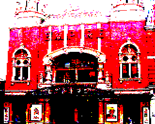
So, here is a picture of Baron Sugar's beloved Hackney Empire (formerly the ATV Television Theatre):

ATV, Rediffusion and ABC all made programmes here

And here it is put through my Amstrad CPC Mode 0 image filter for The GIMP with no dithering:

Amstrad CPC, Mode 0, No Dither

Oh dear. Even the BBC Micro Mode 2 filter seemed to be able to do better:

BBC Micro, Mode 2, No Dither

Here's the Amstrad CPC Mode 0 filter with 2x2 threshold matrix:

Amstrad CPC, Mode 0, Ordered Dither 2x2 threshold matrix

The BBC Micro Mode 2 version with a 2x2 threshold matix seems much flatter and less detailed:

BBC Micro, Mode 2, Ordered Dither 2x2 threshold matrix

So what went wrong with no dithering? Well, the method I'm using to choose a palette is very crude - it picks the sixteen most used colours from the Amstrad CPC palette to go into the final image. If my method is applied an image with lots of dark areas and a few highlights the highlights will be completely missing as the light colours will not be used enough to feature in the final table of 16 colours. I obviously need to find a method that takes into account the range of luminance used on an image.

The situation gets even worse when dealing with the Amstrad CPC Mode 1. Amstrad CPC Mode 1 is very similar to the BBC Micro's Mode 1. But whereas Mode 1 on the BBC Micro can pick 4 colours from a selection of 8, Mode 1 on the Amstrad CPC can pick 4 colours from a selection of 27.

Here's a picture of Polly parrot:


Pining for the fjords

Here's the same picture put through the Amstrad CPC Mode 1 filter with no dithering:

Amstrad CPC, Mode 1, No Dither

Here's the same picture of a parrot put through the BBC Micro Mode 1 filter with no dithering.

BBC Micro, Mode 1, No Dither

Even Sierra3 error diffusion won't help the Amstrad CPC Mode 1 image:

Amstrad CPC, Mode 1, Sierra 3 Error Diffusion

Whereas the BBC Micro filter produces excellent results:

BBC Micro, Mode 1, Sierra 3 Error Diffusion

Needless to say, the Amstrad CPC filters should be producing better results than the BBC Micro filters!

So, I'm going off to find a better way to pick an Amstrad palette! In the meantime, if you want to play with the Amstrad CPC filters they can be downloaded from here. Microsoft Windows users can find out how to install and use the filters with The GIMP by following the very nice set of instructions with pictures I've found here.

Friday, April 30, 2010

Set Piece

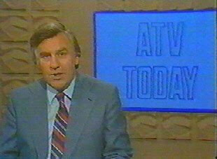
A few months back Roddy Buxton asked if I could do him a favour. His son had a school project about "the 70s", and one of the things they were doing was making a 70s style news programme. As Roddy is from ATV land, that had to mean ATV Today. But in order to make the video authentic, Roddy wondered if I could recreate a section of the ATV Today set to key in behind his son on the video.

Reg Harcourt - ATV Today

I knew exactly the set he had in mind. It was the lovely beige one with an abstract geometrical design. If ever a set designer managed to capture the essence of the seventies current affairs in one set, this was this one. I managed to get a couple of pictures from Jase Robertson's site sub-TV.

At the time, I had mislaid my serial number for Swift 3D version 5, so I couldn't do this in 3D - which would have been the logical way to tackle this job. So, I fired up my trusty copy of Inkscape, and tried my best to muddle through using that.

All I did was take the best screen grab I had to hand (which, sadly, weren't as large or as clear as I would have liked) and trace one square section of the design.

Tracing the set in Inkscape with Margaret Hounsell

I then used gradient fills to create the 3D effect. I've found watching "Paint Along With Nancy" a great help with colouring in vector designs. I use Nancy Kominsky's technique of using three tones (light, medium and dark) and using purple for low-lights and lemon yellow and white for highlights if necessary. Nancy knows her stuff - it works!

Output from Inkscape

After exporting the resulting SVG file as a PNG I used the GNU Image Manipulation programme (otherwise known as The GIMP) to finish the job off. I adjusted the colours to match the image, blurred the image slightly so it would be slightly out of focus, added a tiny bit of HSV noise and then a very slight lens distortion completed the job.

After GIMP-ing, the end result

I've included the images I created at full size in this post, just in case you want to have a go at being Reg Harcourt or Derek Hobson and report on strikes at British Leyland in the comfort of your own home. Just click on them to enlarge.

Friday, April 02, 2010

ATV on the BBC

I have a YouTube channel called "stupidrubbish" where I put bits and pieces of video I've created as and when I get the chance.

The channel's name "stupidrubbish" comes from the rather unaffectionate term my wife uses to refer to television presentation. Her usual question would be "Are you working or are you doing stupid rubbish?". The answer would often be "Both." In Hungarian, the term translates to "hülye szemét" and sounds even ruder than it does in English.

Absolute bobbins, and I freely admit it

Amazingly, although it contains all sorts of bits and pieces I've poured my heart and soul into getting as accurate as possible, the most popular video on the channel is something I very nearly didn't upload at all, and did nearly 25 years ago. It was my first attempt to recreate some presentation on a computer and it was not done in Flash, or even on a PC. It was done on a BBC Master 128 computer in 1986, written in BBC BASIC and was the ATV colour zoom logo.


I hadn't seen an ATV logo in years in 1986, and wondered whether I would ever see one again. You can see from the animation that I couldn't really remember what the logo looked like, or even what happened in the animation, but I suppose it all adds to the charm. I planned the lightspots and the logo out on graph paper using a pencil and pair of compasses.

To draw the logo I used the Acorn Graphics Extension ROM (GXR) arcs (the GXR extensions were included in the Master by default), a GXR custom fill pattern and screen memory bank switching in order to animate the thing. I also used GCOL1 for mixing the colours using a bitwise AND in the lightspots and palette switching to allow me to animate on bits of the logo without having to wait to draw them.

A number of commenters expressed interest in the code, so here it is:

1REM The "ATV" logo
2REM by
3REM Dave Jeffery
10MODE2
20VDU23;8202;0||
30HIMEM=&3000
40*FX112,2
50*FX113,2
60PROCnext_setup
70HIMEM=&3000
80*FX112,1
90*FX113,1
100PROCcircles
110HIMEM=&3000
120*FX112,2
125*FX19
130*FX113,2
140PROCnext
150PROCletters
160END
170DEFPROCnext_setup
180CLS
190VDU23,2,&2A2A;&2A2A;&2A2A;&2A2A;
200MOVE600,500
210MOVE950,700
220PLOT173,250,700
230MOVE600,900
240MOVE250,700
250PLOT173,950,700
260GCOL0,0:MOVE600,700:PLOT157,600,892
270GCOL1,1
280MOVE600,300
290MOVE950,500
300PLOT173,250,500
310MOVE600,700
320MOVE250,500
330PLOT173,950,500
340GCOL3,1
350MOVE600,500
360PLOT157,788,500
370GCOL0,134:GCOL0,7
380PLOT133,600,500
390GCOL16,0
400GCOL0,129
410PLOT133,900,50
420PLOT133,600,688
430:
440c=1
450GCOL0,128
460FORbox=250 TO 958 STEP 8
470GCOL2,c
480MOVEbox,288:DRAWbox,900
490c=c+1:IFc=7 c=1
500NEXT
510GCOL3,15:MOVE600,700:PLOT157,600,888
520:
530ENDPROC
540DEFPROCnext
550VDU19,15,7||
551FORF=0TO75:NEXT
560VDU19,0,4||
570FORF=1 TO 6:VDU19,F,4;0;19,F+8,7;0;
580NEXT F
590FORF=1 TO 6:VDU19,F,3;0;19,F+8,3;0;: FORW=0TO100:NEXT
600NEXT
610VDU19,15,4||
620ENDPROC
630:
640DEFPROCcircles
650VDU19,0,7;0;19,8,0||
660COLOUR8
670Key=GET
680GCOL0,1
690FORloop=600 TO 792 STEP 8
700MOVE600,700:PLOT157,loop,700
710NEXT
720GCOL1,2
730FORloop=500 TO 692 STEP 8
740MOVE500,500:PLOT157,loop,500
750NEXT
760GCOL1,4
770FORloop=500 TO 692 STEP 8
780MOVE700,500:PLOT157,700,loop
790NEXT
800PRINTTAB(5,26);"IN COLOUR"
810FORwait=0 TO 1000:NEXT
820ENDPROC
830:
840DEFPROCletters
850GCOL0,128:GCOL0,3
860MOVE500,708:MOVE500+50,708+150
870PLOT85,500+75,708
880PLOT85,500+125,708+150
890MOVE500+100,708+150: MOVE500+150,708: PLOT85,500+150,708+150: PLOT85,700,708
900MOVE550,708+50:PLOT101,675,708+25
910FORwait=0 TO 1500:NEXT
920MOVE500,652:PLOT101,700,628
930MOVE575,628:PLOT101,625,528
940FORwait=0 TO 1500:NEXT
950MOVE500,328+150:MOVE500+50,328
960PLOT85,500+75,328+150
970PLOT85,500+125,328
980MOVE500+100,328: MOVE500+150,328+150: PLOT85,500+150,328: PLOT85,700,328+150
990REPEATUNTILFALSE
1000ENDPROC

If you want to run the code, why not pop along to BBCMicro.com, where you can get hold of a BBC Emulator to try this out for yourself.

If you run the code in an emulator (or on a real BBC Master 128) you'll notice I took a few liberties with the timings when I was editing the video together to upload to YouTube!

Hopefully I've got a bit better at recreating the ATV logo since then. A more recent attempt, in Macromedia Flash 8, is here:

Wednesday, October 28, 2009

G Spots

While I was producing a title sequence for the "A Shower Of Shot" documentary, Rory Clark asked me if I would also produce some little animations that would appear in the documentary itself.

Rory had decided to break the documentary into sections, with the title of section being a word beginning with the letter g. He asked me if I would produce a few seconds of animation that would introduce each of the sections. He gave me a list of words "girls, gifts, gags, gaffes, etc." and let me get on with it.

I started by creating all the words Rory gave me in Inkscape, and exported them all for import into Macromedia Flash 8 as .eps (Encapsulated Postscript) files.


Why don't you build yourself a word...

My first idea was a bit too elaborate; I got carried away, which I often do! I produced an apple on a gradient background...


...that gets hit by a bolt coming out of a crossbow...


...smashing the screen...


...and revealing the name of the section underneath.


Rory gave me a bit of much needed direction and said he simply needed the word "golden..."...


...which would then be hit by a bolt...


...you'd see a flash...


...and with a quick shudder...


...the title of the section would be revealed.


Another thing Rory asked me to do was a breakdown caption. One of the things he remembered about watching "The Golden Shot" as a child were the breakdowns caused by technical difficulties, strikes or IRA bomb threats. These were the joys of live television in the 70s.

Obviously there was no argument about the style - Rory wanted an HTV holding transparency in the style we both remembered from the seventies which was handy as I would have probably given him one of those anyway! I selected a suitably naff publicity shot of Bob from a selection Rory sent to me and recreated in Inkscape what we would have seen in Wales and the West in the case of one of the aforementioned catastrophies.


The polyester clad stars of Wednesbury Co-op cheese counter...

Another thing Rory asked me to do was to add, for technical reasons, a few seconds of grey onto the beginning of the ATV Colour Zoom. Whilst I was happy to oblige, I suggested that he might also like to add this:


A fitting place to finish, I think.

I created it by tracing the caption that appears on the front of a telerecording of the last Golden Shot Bob presented in 1972 after he had been sacked for no reason whatsoever by Francis Essex. I used Inkscape to create the entire caption -  I couldn't face drawing something as fiddly as this in Flash anymore! I must be getting old...

And with that, my work on the "A Shower Of Shot" documentary was done.