Saturday, April 23, 2011

Replay Replayed

Replay Expo time is fast approaching again, which is why Barbara Kelly and Lady Isobel Barnett are pictured below modelling an original piece of my artwork:

Sadly, Doris Speed wasn’t free.

Replay Expo is an Arcade, Video Game and Retro show that takes place every autumn at the Norcalympia Exhibition Centre in Blackpool. Last year’s event attracted 3,200 visitors over two days and the organizers are hoping to attract 5,000 this time. The show is timed to coincide with the last weekend of Blackpool Illuminations.

Last year I was involved in designing fliers, banners, advertisements and the website for the show and the organisers very kindly asked me if I would like to continue doing so this year.

r3play 2010

The first thing I needed to do was devise a “Replay” logo for this year’s event. The brief was “the same, but different”. The previous logo was originally designed by “Greyfox”, also known as the talented Irish graphic designer Darren Doyle. It was a beautiful logo and worked fantastically well so I wanted to keep as close to it as possible.

I had two main ideas. Firstly, I wanted make the logo a little more colourful, as the show will be a little more colourful this year. Secondly, I wanted to include a cartoony black outline around the lettering to increase the contrast from a distance and also to evoke the black outlines around cartoony video game characters.

In addition the logo had to be vector illustration, as I would need to export it at some very large sizes indeed. This meant I created it entirely in Inkscape.

This is what I came up with:

replay 2011 – click to enlarge

It was one of the only occasions I’ve ever got it right first time! You’ll notice I had to reverse the “E” because last year people insisted on calling the previous event “are three play” which rather upset the organizers!

B790 – I’m sure this face has a real name!

Next was the question of typography. Last year was easy – I was using lots and lots of lovely Microgramma. This year it was again “the same, but different”, so I settled on a Hermann Berthold art deco typeface called B790. This was similar enough to Microgramma that I could use it in the same sort of ways, whilst at the same time looking very different.

The one thing I was disappointed about this year was the design of the 2011 lettering. I spent day after day producing draft after draft:

My favourite – I spent hours on this!

Another massive fail

Obviously massive fails come in threes

However, in the end nothing I produced seem to grab the client – something that was entirely my fault. In the end, with half an hour or so to spare before stuff went needed to go off to the printers I gave up and produced something quick I’m really ashamed of.

At least the client liked it.

As you can see, the B790 ended up with a bit of a starring role as I used it for the word “EXPO”.

Producing the fliers and roll up banners for Replay Expo was rather interesting this year as the printers decided that only CMYK PDF files were acceptable. In previous years, they had accepted RGB TIFF files exported at 300dpi (dots per inch), which I could export from either The GIMP or Inkscape. But neither Inkscape nor The GIMP can currently produce CMYK PDF files. Therefore, after meaning to do so for nearly three years now, I finally had a good reason to grips with Scribus, a free software desktop publishing package.

The first thing I had to do was a lot of reading. The Scribus documentation is excellent and very thorough, so it was a pleasure to go through it all. Then I went through the tutorial. I had to do that when the children were at school as the first couple of hours featured a statue of a rather forgetful Indian lady who had absentmindedly neglected to put on her undergarments.

She’ll catch her death of cold…

Fortunately, I had colour management set up on my computer, so soft-proofing worked perfectly. This meant that whatever I saw on screen was very close to how my finished artwork would appear in print.

I produced my Replay logo artwork in Inkscape, and exported the logo as a 300dpi RGB PNG file for import into Scribus. Usually I could import my Inkscape files directly into Scribus, but in this instance I was using Inkscape layer effects (i.e. SVG image filters) that Scribus is currently unable to cope with.

Flier created in Scribus

I then created the text and frames directly in Scribus, and imported the photographs into them. It’s actually a very nice way of working as you are using each tool for what it does best.

Once finished, I could export my Scribus file as a CMYK PDF, send it off to be printed and hope for the best.

This was all completely new to me, and I was really nervous as to whether my exported PDF files would even be accepted by the printers, let alone print properly. What was worse was the fact that the Gadget Show Live event was two days away and there wasn’t time to do anything if my files were no good!

Anne Ladbury and Mary Morris

However, as you can see, they turned out quite well. Scribus is an excellent piece of software and I would recommend it to anyone.

Replay Expo takes place at the Norcalympia Exhibition Centre, Norbreck Castle, Blackpool on the 5/6 November 2011. Tickets for the event are available from http://replayexpo.com/tickets

Thursday, April 21, 2011

Fedora 15 Beta, GNOME 3

Recently, a rather nasty crash caused by the gftp FTP client locked me out of all my files and shut me out of my Desktop. The program is rather ropey and has done odd things to my computer before so I really shouldn’t have been using it.

Still, every cloud has a silver lining and since then I’ve moved to Filezilla as an FTP client (which is a lot better anyway) and become rather less blasé about making backups.

GNOME 3 Desktop - Click to enlarge

As I needed an OS reinstall I also decided to take the plunge and install Fedora 15 Beta. I’d been reading about GNOME 3 for years so I thought it was high time I tried it for myself.

Here are my thoughts so far:

Pros:
  • I was delighted to find my Trust 5300 graphics tablet works out of the box. No compiling and installing Wizardpen and playing around with settings. This is very important to me as I’m fond of using MyPaint to paint pictures when I'm listening to podcasts. It’s also very useful in conjuction with The GIMP.
  • I was disappointed at first to find that Colour Management was missing, but once added using Add/Remove Software it’s better than ever. Work has been done to make it easier to use and it has had some bug fixes too. Colour Management would be enough to justify my using GNOME3 on my production machine.
  • Firefox 4 is fantastic – I love being able to play HTML5 videos at long last without needing a Flash plug-in.
  • I was surprised that I couldn’t just press Delete in the Nautilus File Manager to remove files. You have to press Ctrl+Delete together. However, I like this better as it makes it much harder to delete things by accident.
  • It only took me about 30 seconds to work out how to use it.
  • It gets out the way most of the time and lets you get on with your work.

Cons:
  • The most serious problem is what happens when you switch off the computer. For some reason the Shut Down option is missing unless you hold down the Alt key. By default, you can only Suspend, rather than Shut Down your computer. This would be no problem at all if it were not for the fact that Suspend only works about one time out of four for me; Suspend is simply not stable enough to replace Shut Down.
  • You cannot alter how fonts are hinted on screen. This is very irritating as the default settings make text look, frankly, revolting.
  • The weather widget is missing – it showed the current weather, temperature and windspeed. I find that hugely irksome – I don't mind it not being on the desktop but you should be able to see it when you click on the time at the top of the screen.
  • The title bars on the windows are too tall for no good reason. The whole of the rest of the interface seems to be about conserving vertical space, yet this throws away everything gained by losing the bottom panel.
  • Some dialog boxes are missing close buttons.

The whole system feels very stable indeed and I’m using it on my production machine quite happily even though, really, I shouldn’t be!

It’s just not Flash…


I’ve finally worked out I can put YouTube videos in my blog that can be viewed without having the Flash plug-in installed. Which is handy for me, as I don’t have the Flash plug-in installed. And presumably it’s also a boon for anyone using one of those ingenious new Apple etch-a-sketch things.

So, now I can watch stupid rubbish without using my daughters’ computer, here’s some that I (and Rory) made earlier…

Tuesday, April 19, 2011

Notable Use

I was looking at the excellent Chris’s Acorns site the other day, when I found another archetypal use of Christine Lord’s Oxford typeface on a BBC Micro peripheral:

Judging by the LEDs, it also doubles as a light show

This is precisely the sort of application for the Oxford face I remember seeing all over the place as a child. Whatever would the UK electronics industry have done without it?

Monday, April 18, 2011

Gotta Dash

One of the most interesting aspects of working on Repton: The Lost Realms was having my sleeve artwork and inserts proof-read by Michael S. Repton. Michael is a professional proof reader, a linguist and someone who really knows his stuff.

Michael S. Repton playing Galaforce
Photo Courtesy Joel Rowbottom

One of the things that Michael disliked about my copy was my use a minus sign to indicate a pause. I had to replace every single one with something called a spaced en-dash.

Of course, I’m not really to blame for this – computer keyboards are rather deficient in the punctuation department. As a rule, they don’t have a real apostrophe or proper opening and closing quotation marks. But whilst your keyboard doesn’t have these symbols, your computer almost certainly does. If you have a look at the Character Map application you can find them all.

Character Map on Fedora 14 - Click to enlarge

The problem is that using the Character Map application every time you wanted an apostrophe or quotation marks would be too slow on a large document. Fortunately there is another way of entering these punctuation marks in GNU/Linux. You hold down Ctrl and Shift, press the u key, type the four digit Unicode value for the symbol you want and press ENTER.

So, an en-dash is Ctrl+Shift+u 2013 ENTER. After a while, you find you remember the most common symbols. An apostrophe is u2019, quotation marks are u201c and u201d and so on.

Characters of Gnote

To help me remember the less common symbols I put a list on a pinned Gnote, which I can call up easily whenever I need it.

Sunday, April 17, 2011

All The Hues That’s Fit To Print

Whenever I’m using a complicated piece of software, I find it’s invariably the things that I ignore that turn out to be the most important.

The Blob

When a strange, grey blob-shape appeared between my scrollbars in Inkscape about 18 months ago I completely ignored it and carried on drawing and colouring in. Not only was it vitally important, but if I had only been curious enough to find out what it was sooner I would have discovered a whole new and fascinating world: colour management.

I’ve never had enough money to own a colour printer; I only have a monochrome laser printer which I use very sparingly as a toner cartridge is almost third of my wife’s monthly salary. So I’d never really thought about colour printing until I started designing covers for Retro Software. Dave Moore would sometimes ask me to change this colour or that colour as “it looked awful when printed out”, I’d grumble and change the colour and that would be as far as my interest in printed colour would go.

If I kept myself up to date a little more dilligently I would have realised that that little blob-shape would have allowed me to see what my designs would look like when printed right there in Inkscape.

Colour management seems like too much faff to bother with at first, but is actually pretty simple. When you’re designing on screen, you’re working with light. Light is “additive” – every time you mix colours together you get a lighter colour.  This is usually illustrated using the famous “light spots” you may remember from school (or college):

Avez Vous Le Tempo?

So, for instance, cyan looks lighter than the green and blue you mix together to make it.


When you print you’re working with inks, which get darker as you mix them together. So, for instance, the colour blue is much darker than the cyan and magenta inks you mix together to make it.


The upshot of all this is that there are (quite a lot of!) colours you can show on your monitor that you simply can’t reproduce in print. Pure blues and pure greens that look vivid and exciting on screen look like faded socks and mouldy cheese when printed out.

The precise range of colours you can use on a printer depends on the type of printer you are using. A colour newspaper press can print a far narrower range of colours than the one used to produce a colour magazine.

Conversely, a printer can produce darker colours than you can reproduce on a screen. And each model of scanner, monitor and digital camera has its own quirks as to the range, or gamut, of colours they can deal with.

A horseshoe, apparently

Hence the blob – the blob-shaped icon was based upon the standard horse-shoe shaped graph used to illustrate colour spaces.

The solution to the problem of differing colour gamuts was the creation of a file format called an .icm file. Each .icm file contains an ICC profile which describes the colour gamut of a monitor, printer, camera or scanner. This means that provided you have an .icm file for your monitor and a .icm file for the printer you want to use, your graphics program should be able to use them to show you on screen what your output will look like when it’s printed.

Getting hold an .icm file for your monitor is a pain. Professionals have hardware  calibration devices that they use in conjunction with a program like ArgyllCMS in order to calibrate their monitors. Windows users with Adobe software can use Adobe Gamma. The rest of us can make-do by using a tool called lprof and create a profile by eye. You may find you need to adjust the colour temperature of your monitor to 6500K before you calibrate your screen.

If you are using Fedora, Colour Management is very, very easy to set up in Inkscape. First, you have to get a program called lcms using the “Add/Remove Software” tool. Once you have installed it, you simply have to click the mouse a few times in an Inkscape dialog box and that’s really all there is to it.

Settings to see the effect of Colour Management

Here, I’ve just checked the “Simulate proofing on screen” and chosen a printer .icm in the “Device Profile” box. The display profile should be the profile of your monitor – I haven’t generated one yet so I'm using sRGB.

The Blob In Colour

The blob-shaped icon now springs to life. It is not only in glorious colour but it has also become a button; pressing it has interesting results. Here is my drawing without pressing the blob-shaped button:

Living Colour on screen…

And here is my drawing with it pressed in:

…but the blue and green won't look as good printed!

This is a huge help when designing, as I can now see what my RGB designs will look like when printed out in CMYK.

There is a lot more to the subject of colour management, even in Inkscape. You’ll have to do a bit of research on the web to get to know which .icm profiles to use and the best workflows for CMYK output. But hopefully I've encouraged you to at least have a play!

Friday, April 08, 2011

When Yak met Goat


If you don’t know who the gentleman playing Repton: The Lost Realms is, then it’ll probably be impossible for me to explain how happy discovering this picture earlier this week made me feel.

Tuesday, March 22, 2011

Nancy Kominsky (1915 - 2011)

Nancy Kominsky passed away on the 11th of March, 2011.


Through her HTV West series, Nancy didn’t just inspire and teach me. More importantly, she gave me the courage to not give a damn what anyone thought of my efforts and not give up. Provided that I was having fun and progressing, nothing else mattered.

And, thanks to the magic of DVD, she inspired my two daughters as well. Although they are only 8 and 9 years old both of them know about “light, medium and dark tones” and “where the light is coming from” – Nancy explained these fundamental ideas so clearly that even children could, and did, understand them.

You Know When You’ve Been Tango-ed

My friend Samwise and I are both enthusiastic users of the GNU/Linux operating system and also enormous fans of the incredible range of retro computing emulators produced by the brilliant Tom Walker.

Tom (left) and Samwise (right)
Photo courtesy regregex

There’s seemingly nothing that Tom isn’t able write an emulator for. He’s written emulators for everything from the humble Acorn Electron to the StrongARM-ed Risc PC with Spectrums, Amstrads, Beebs, Archimedes and much else in between.

Elkulator, running on Fedora 14

So it wasn’t altogether surprising when, last month, Sam asked if I could create some icons for his desktop he could use with Tom’s emulators.

Superior's EGO:Repton4, running on RPCEmu

Sam is a KDE desktop power user, whereas I’ve always been a GNOME numpty. Fortunately for us starving scribblers and colourers in there is a project that aims to standardise all free software desktops and ensure we can create icons once that look good on all of them. The project is called the freedesktop project and the part concerning icons is called Tango.

There are numerous tutorials on the web that explain how to create Tango icons in both Inkscape and The GIMP.

The first icon I tried to create in Tango format was the three dimensional RISC OS era Acorn logo, to use with Arculator. Below, you can see the real Acorn logo on the left, and the “Tango”-ed version on the right.

More Tango-ed than Judith Chalmers

As you can see, the Tango version looks rather cartoonish – and the colours are rather muted and pastel. And the direction of the light source has been changed. This was all done deliberately and in order to follow the Tango guidelines.

Sam was happy with this icon and asked if I could create icons for all of the Acorn-related emulators. And that’s when sticking to the rules started to get a bit of a pain. For Tango icons, each icon should be a distinctive shape in order to help those with poor eyesight and each icon should also contain a metaphor as to the icon’s purpose.

However, for the emulators all that we really needed was a square icon with a logo that told you at a glance what computer you were using so the guidelines rather went out the window. The Tango colours were also very restrictive as far as what I could use so I just threw caution to the wind and did what I felt!

Here’s the Elkulator icon:


I really like the background grid, which was the trademark of the Acorn Electron.

Here’s the B-Em icon:


And here’s the RPCEm icon:


I also created some Archimedes artwork – here's the Archimedes logo I created as an SVG file in Inkscape:

Click to enlarge.

Here it is “Tango”-ed!


And here are the full set of icons I created for Sam:

Click to enlarge

In future, when I have more time, I’ll create proper Tango themed icons for all of these emulators. I spent about two minutes on each of the icons above and it shows! This will require me to actually draw the systems being emulated and make sure that I've got a different shaped outline for each one.

So I'll probably return to this topic when I've done some decent, real, Tango icons!

Sunday, March 20, 2011

Jewel Chase In A Jewel Case

Thanks to Dave Moore at Retro Software, I received a very exciting package in the post last week:


It seems so strange to go from a sketch on an envelope, to producing artwork in Inkscape to a finished product on my shelf with a 5.25" floppy inside.

If you want to get hold of your own copy of Repton: The Lost Realms, it is available here.

Saturday, March 19, 2011

Back to Oxford

If you've had a good look at my blog you'll know that, though the medium may vary, it's essentially all about me copying something that someone else has done. Badly.

This is all very well in as much as it serves to keep a useless eater off of the streets of Kiskunhalas. However sometimes, to my acute embarrassment, the original creator of something I've been butchering gets in touch with me.

This first happened to me over ten years ago when Terry Griffiths, the designer of the London Weekend Television "river" ident sent me a very nice e-mail about the rather dodgy Flash Files I had created based on his work. They are still on Andrew Wiseman's 625 Television Room site. I later ended up animating Terry's idents in 16:9 for London Weekend Television's last day.

Christine Lord, pictured in 1969

The most recent example was last week when Christine Lord, original designer of the Letraset Oxford typeface got in touch with me after reading this blog.

I was thrilled to hear from Christine for several reasons - first and foremost because she's a lovely person, who was kind enough to send me some lovely goodies with her e-mail.

My version of Oxford in FontForge

Then there's the fact that I've never been in touch with a type designer before, let alone someone who had designed such an iconic part of my childhood.

And finally my blog allowed Christine to get Profonts' Sportowy font renamed as OXFORD PF and to get herself a well deserved credit as the typeface's original designer.

Thanks to Christine I can fill in a little more of the background behind the Oxford typeface. The face was designed in 1969 when Christine was 21 as a special project to create a corporate identity for the new Oxford Polytechnic. The face was originally called Lord Lower Case Linked, but was later renamed Oxford when picked up by Face Photosetting. It was then made available as dry transfer lettering by Letraset.

Another use of Oxford

I've also come across another example of Oxford being used, this time on the excellent TV-Ark website. It was used for Sheffield Cablevision, a short lived but very popular Yorkshire cable station. It's worth taking a look at the link as the station featured a presenter with a truly splendid comb-over.

If you are daft enough to want to get my version of Oxford, which I called "Scene", it's available for download here. Windows users will need to download the excellent (and free) 7zip utility in order to unzip the tar.gz file.

My version of Oxford features an upper case but, mercifully, I don't think Christine has seen that yet!

Friday, December 24, 2010

Thursday, November 18, 2010

Coloured Sugar

Once I'd finished writing a range of BBC Micro Python-Fu image filters for The GIMP, the Amstrad CPC series seemed the obvious next computer to tackle.

The graphics capabilities of the CPC were very similar to those of the BBC Micro, but the CPCs benefitted greatly from having many more colours available. Everything you could ever want to know about the video capabilities of the Amstrad CPC range is explained here.

The graphics capabilities are so similar, in fact, that to create a graphics filter for Amstrad CPC in Mode 0 all I had to do was change the palette data in my BBC Micro Mode 5 filter. Instead of picking 4 colours from a range of 8 the filter simply needs to pick 16 colours from a range of 27.

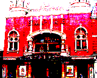
So, here is a picture of Baron Sugar's beloved Hackney Empire (formerly the ATV Television Theatre):

ATV, Rediffusion and ABC all made programmes here

And here it is put through my Amstrad CPC Mode 0 image filter for The GIMP with no dithering:

Amstrad CPC, Mode 0, No Dither

Oh dear. Even the BBC Micro Mode 2 filter seemed to be able to do better:

BBC Micro, Mode 2, No Dither

Here's the Amstrad CPC Mode 0 filter with 2x2 threshold matrix:

Amstrad CPC, Mode 0, Ordered Dither 2x2 threshold matrix

The BBC Micro Mode 2 version with a 2x2 threshold matix seems much flatter and less detailed:

BBC Micro, Mode 2, Ordered Dither 2x2 threshold matrix

So what went wrong with no dithering? Well, the method I'm using to choose a palette is very crude - it picks the sixteen most used colours from the Amstrad CPC palette to go into the final image. If my method is applied an image with lots of dark areas and a few highlights the highlights will be completely missing as the light colours will not be used enough to feature in the final table of 16 colours. I obviously need to find a method that takes into account the range of luminance used on an image.

The situation gets even worse when dealing with the Amstrad CPC Mode 1. Amstrad CPC Mode 1 is very similar to the BBC Micro's Mode 1. But whereas Mode 1 on the BBC Micro can pick 4 colours from a selection of 8, Mode 1 on the Amstrad CPC can pick 4 colours from a selection of 27.

Here's a picture of Polly parrot:


Pining for the fjords

Here's the same picture put through the Amstrad CPC Mode 1 filter with no dithering:

Amstrad CPC, Mode 1, No Dither

Here's the same picture of a parrot put through the BBC Micro Mode 1 filter with no dithering.

BBC Micro, Mode 1, No Dither

Even Sierra3 error diffusion won't help the Amstrad CPC Mode 1 image:

Amstrad CPC, Mode 1, Sierra 3 Error Diffusion

Whereas the BBC Micro filter produces excellent results:

BBC Micro, Mode 1, Sierra 3 Error Diffusion

Needless to say, the Amstrad CPC filters should be producing better results than the BBC Micro filters!

So, I'm going off to find a better way to pick an Amstrad palette! In the meantime, if you want to play with the Amstrad CPC filters they can be downloaded from here. Microsoft Windows users can find out how to install and use the filters with The GIMP by following the very nice set of instructions with pictures I've found here.